What's Up In Toronto
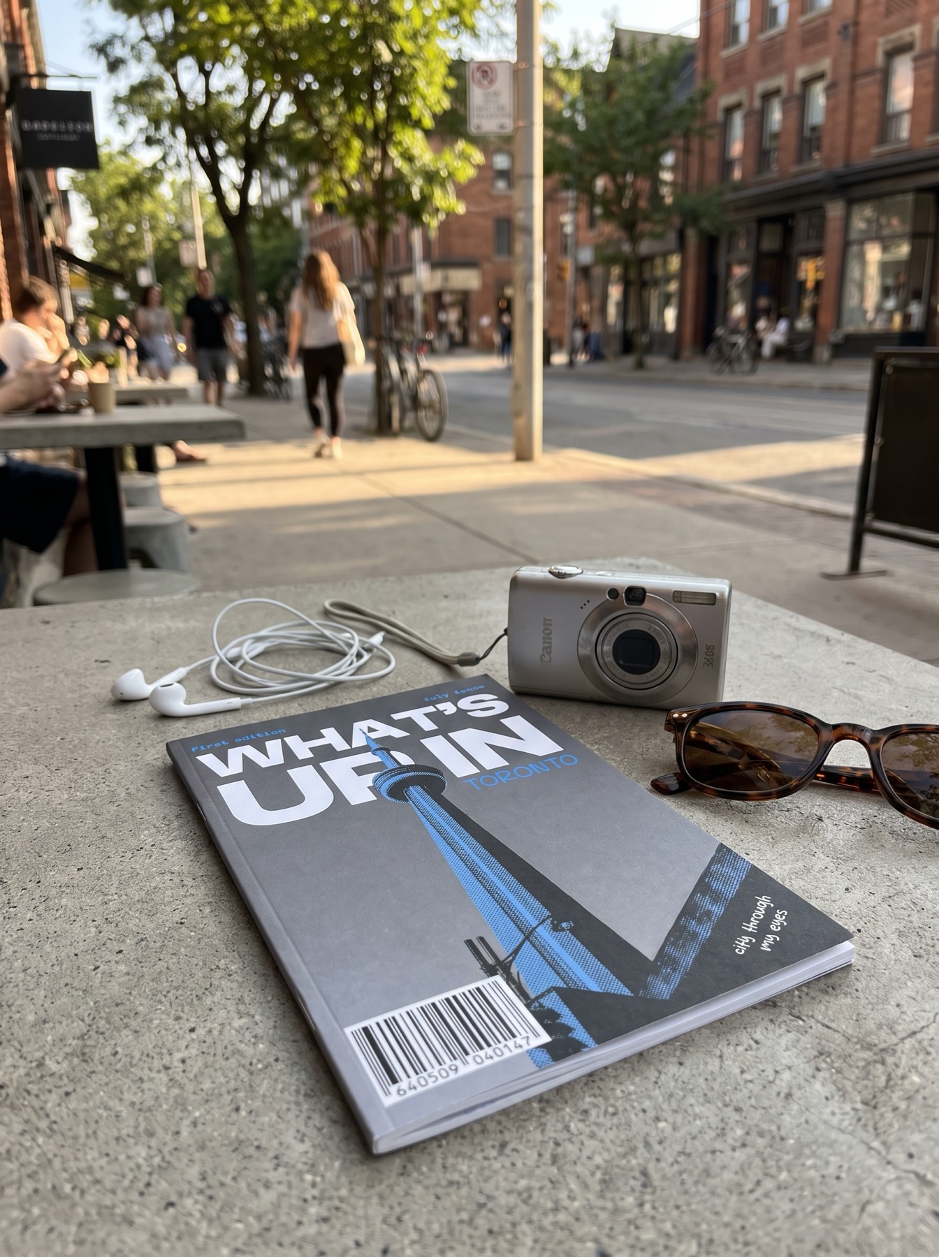
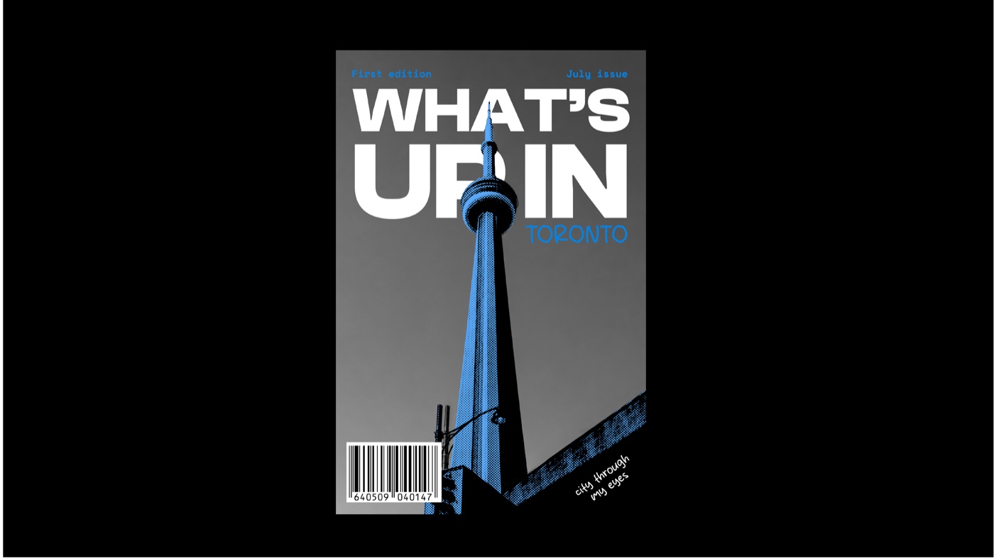
What's Up In Toronto is a self-published alternative travel and culture zine that skips the glossy, corporate tourist-guide voice for something rawer - the working artist studios, back-alley galleries, and neighbourhoods locals actually talk about. It's built for creatives and design students aged 18-30, sitting in the gap between sterile corporate city guides and expensive indie coffee-table magazines.
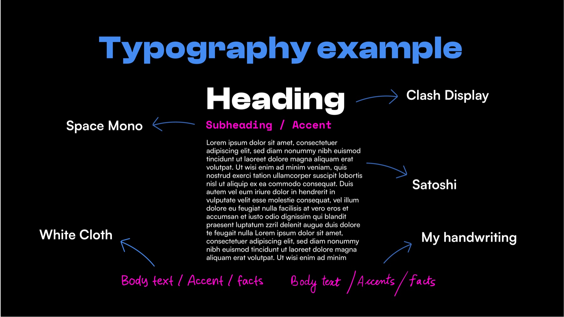
Every word and photograph in it is mine. I laid it out across a 10-column InDesign grid with a tactile, 90s-scrapbook energy - halftone textures, hand-drawn doodle accents, and my own handwriting mixed with clean geometric type - so the design reads like a page pulled from a local friend's sketchbook, not a travel brochure.
The first issue covers Toronto: a 24-page love letter built around off-the-grid features like Kensington Market and the artist studios inside 401 Richmond, plus a full-roll photo essay shot with no deletes and no do-overs.
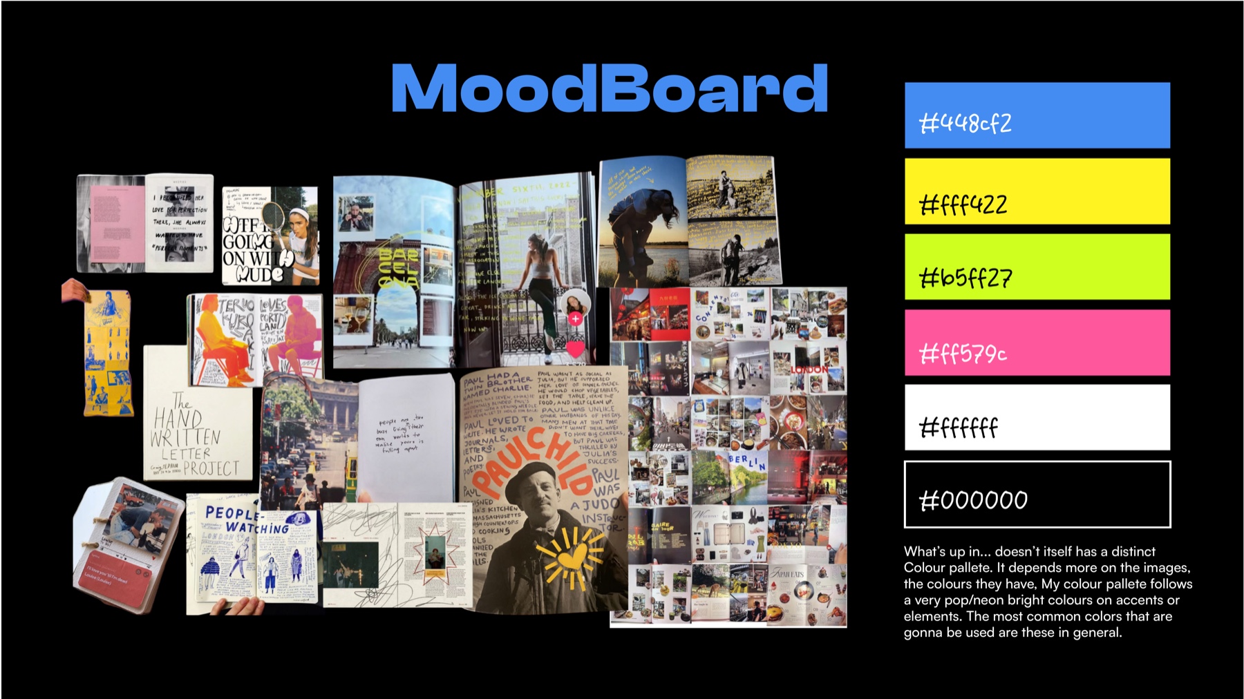
Moodboard & Colour
Typography
Cover Design
Print Mockups
Feature: Get Lost in Kensington
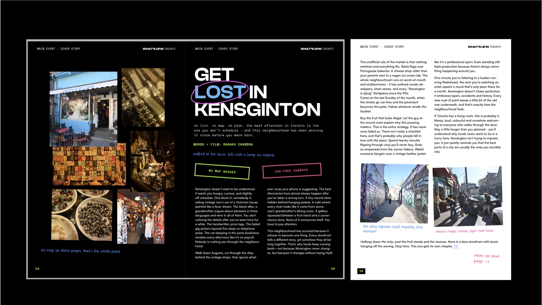
No map, no list, no plan - the entire piece is built around the idea that Kensington's best moments only happen once you stop trying to schedule them.
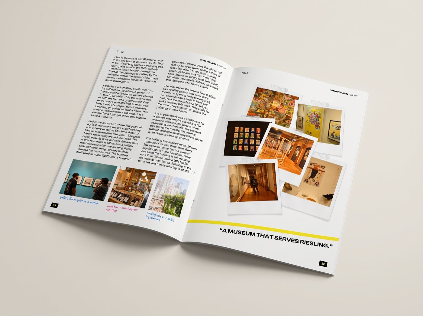
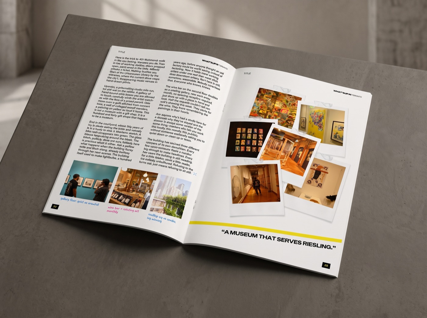
Feature: The Building That Refuses to Die
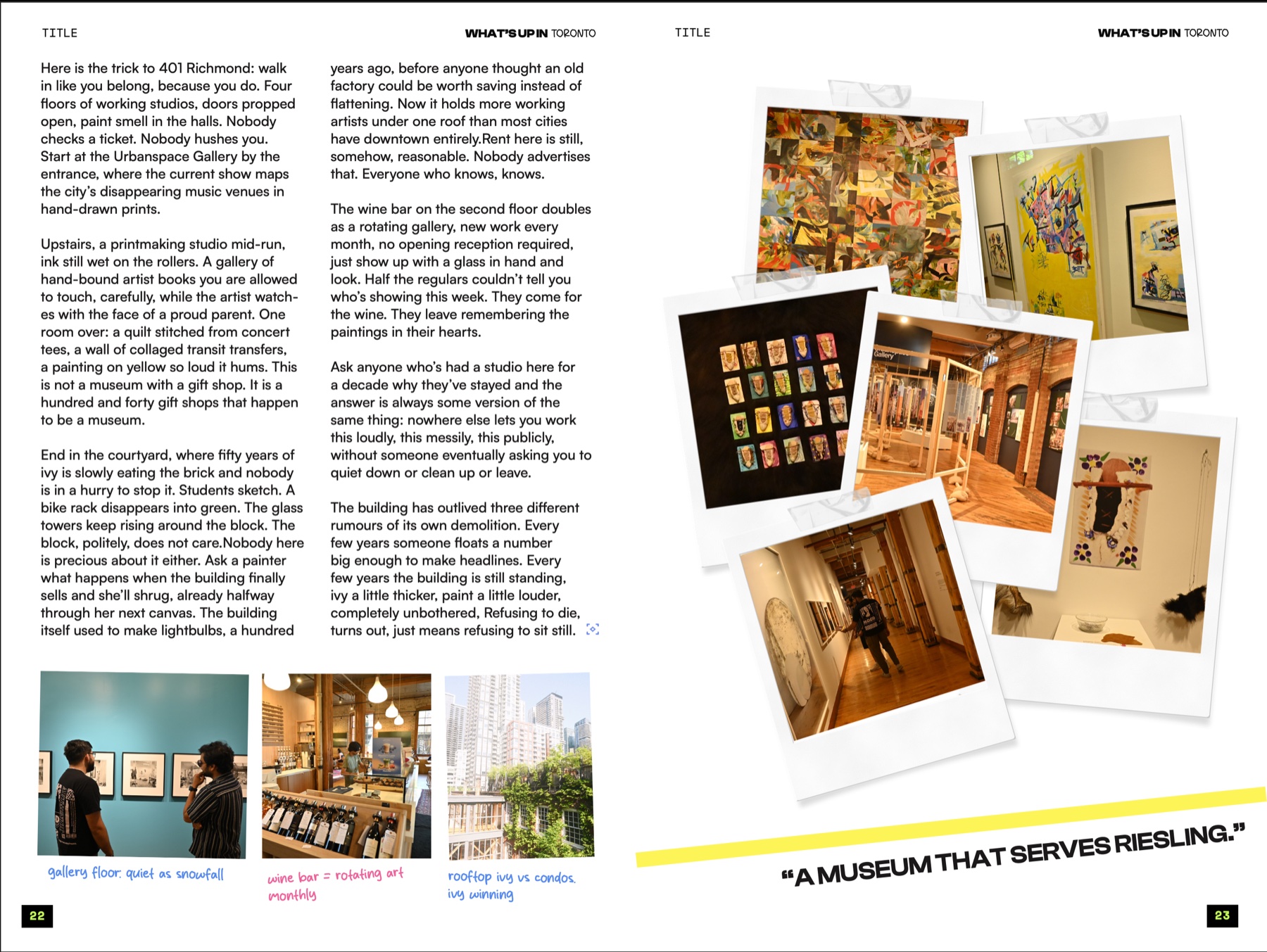
A profile of 401 Richmond - the century-old lightbulb factory that's outlived three demolition rumours and now holds more working artists under one roof than most cities have downtown entirely.
Feature: Every Frame Made The Cut

Sixty-some shots, one city, no deletes and no do-overs - a full-roll photo essay built around the idea that a blurry photo of a real afternoon beats a sharp photo of an over-timed moment.
Process: Grid & Margins
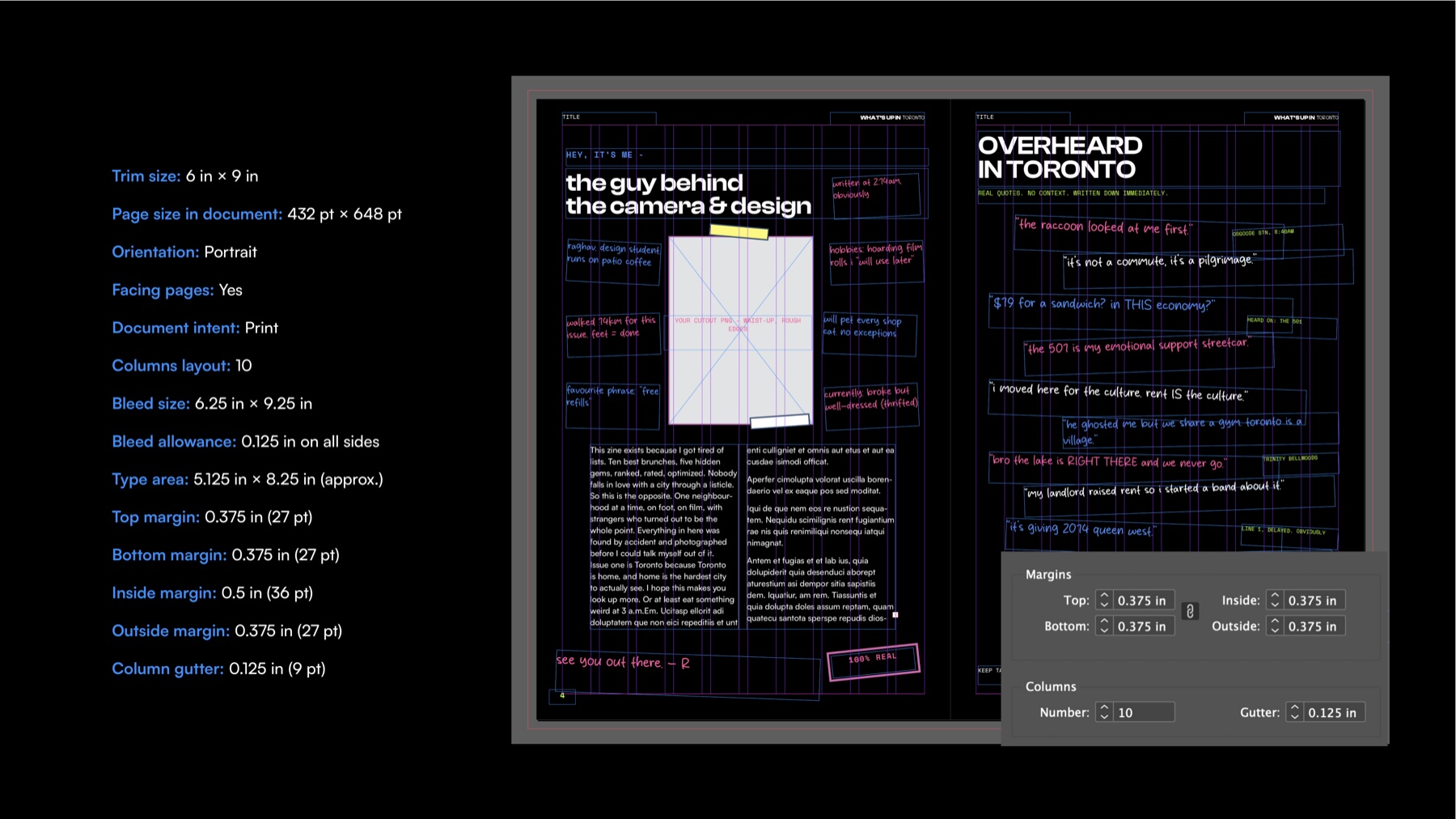
6 × 9in trim, 10-column grid, 0.375in margins - tight enough to hold the layout together, loose enough for handwritten notes to spill past the edges on purpose.
Reflection
This was the first time I designed something meant to be read cover-to-cover instead of scrolled past. The hardest part wasn't the layout system, it was writing copy weird enough to match it - once the voice clicked, the halftones, the handwriting, and the pull quotes all had somewhere real to live instead of just decorating the page.