SPLITFORM - A Type Design Application
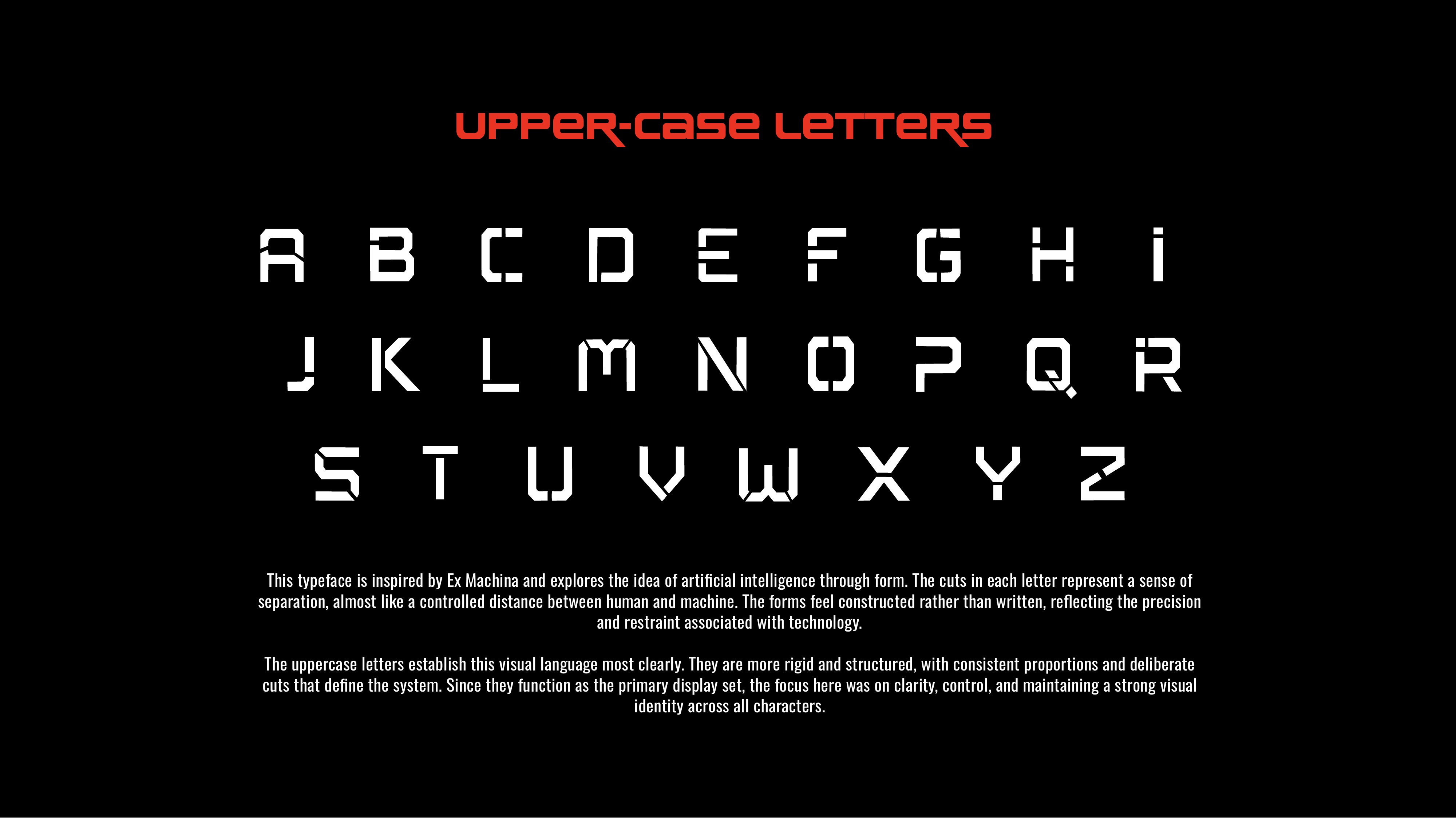
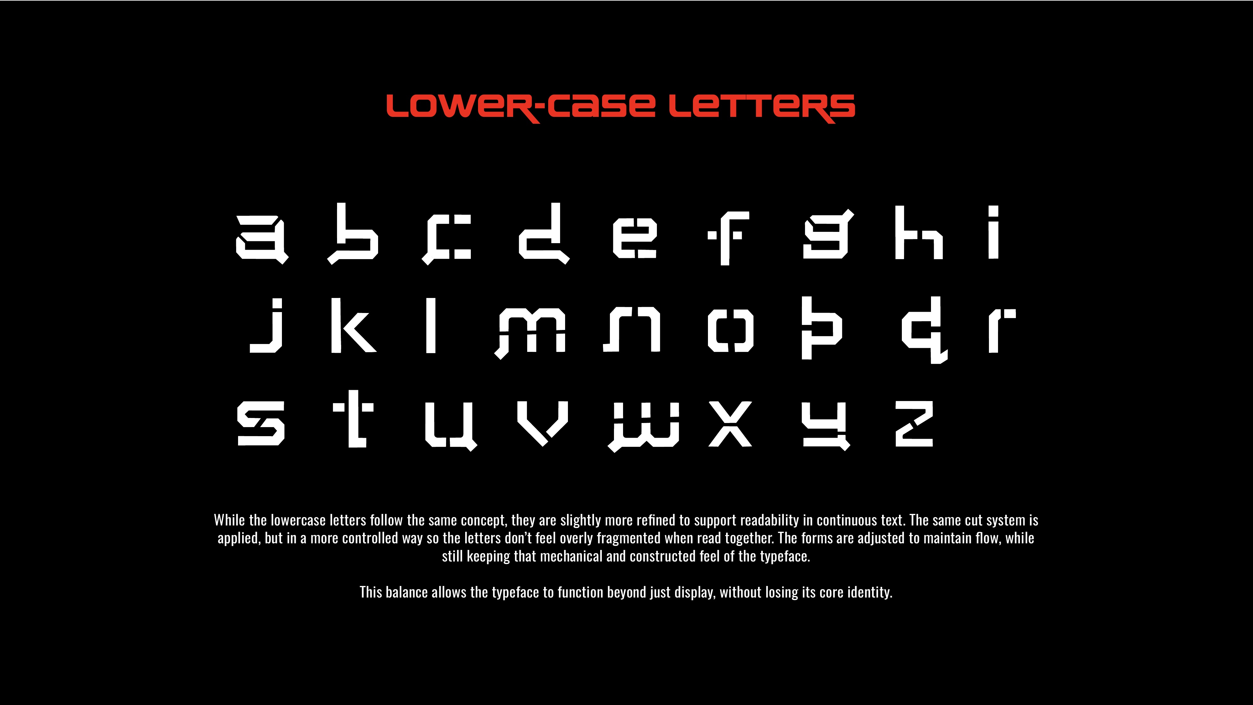
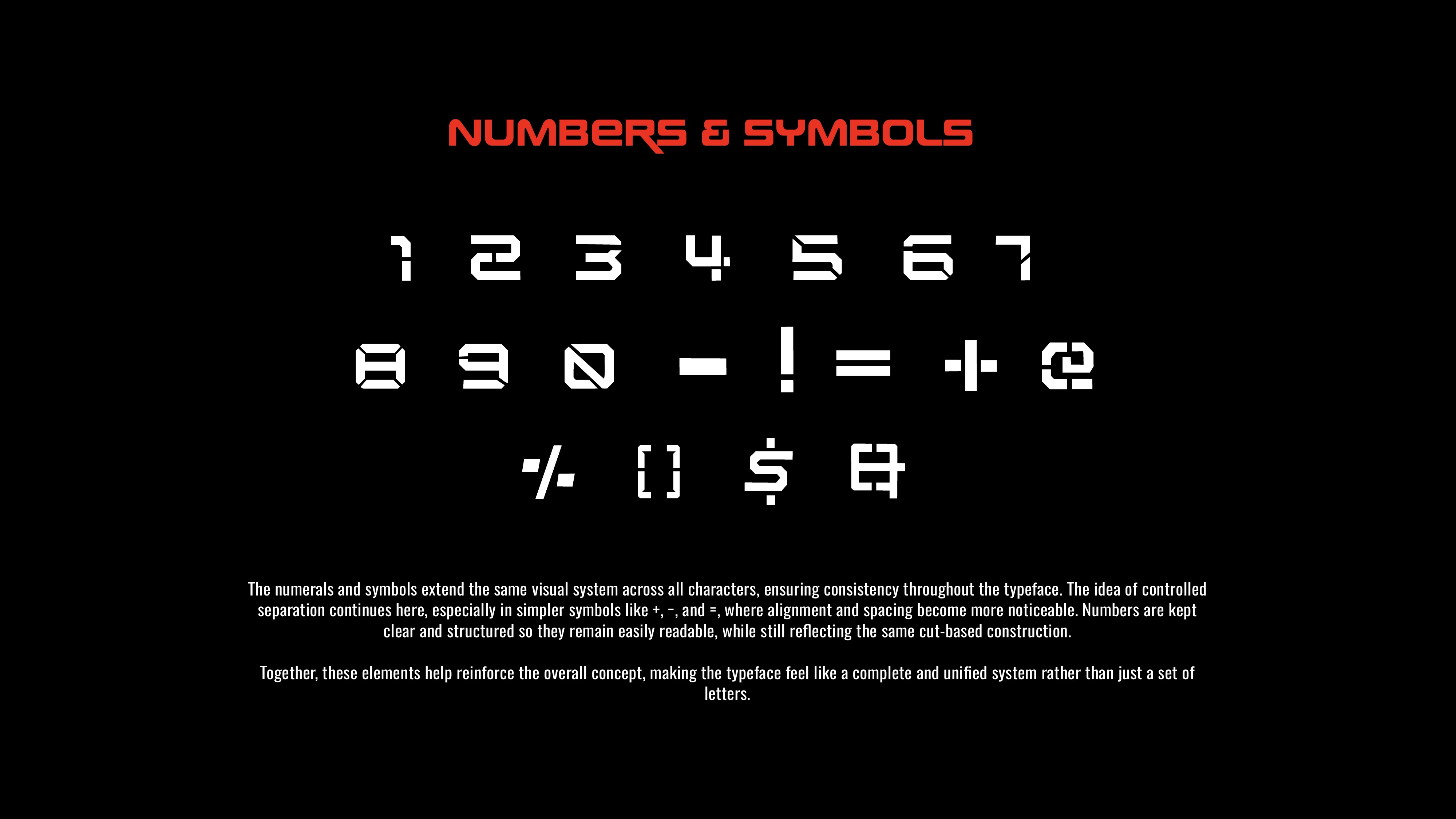
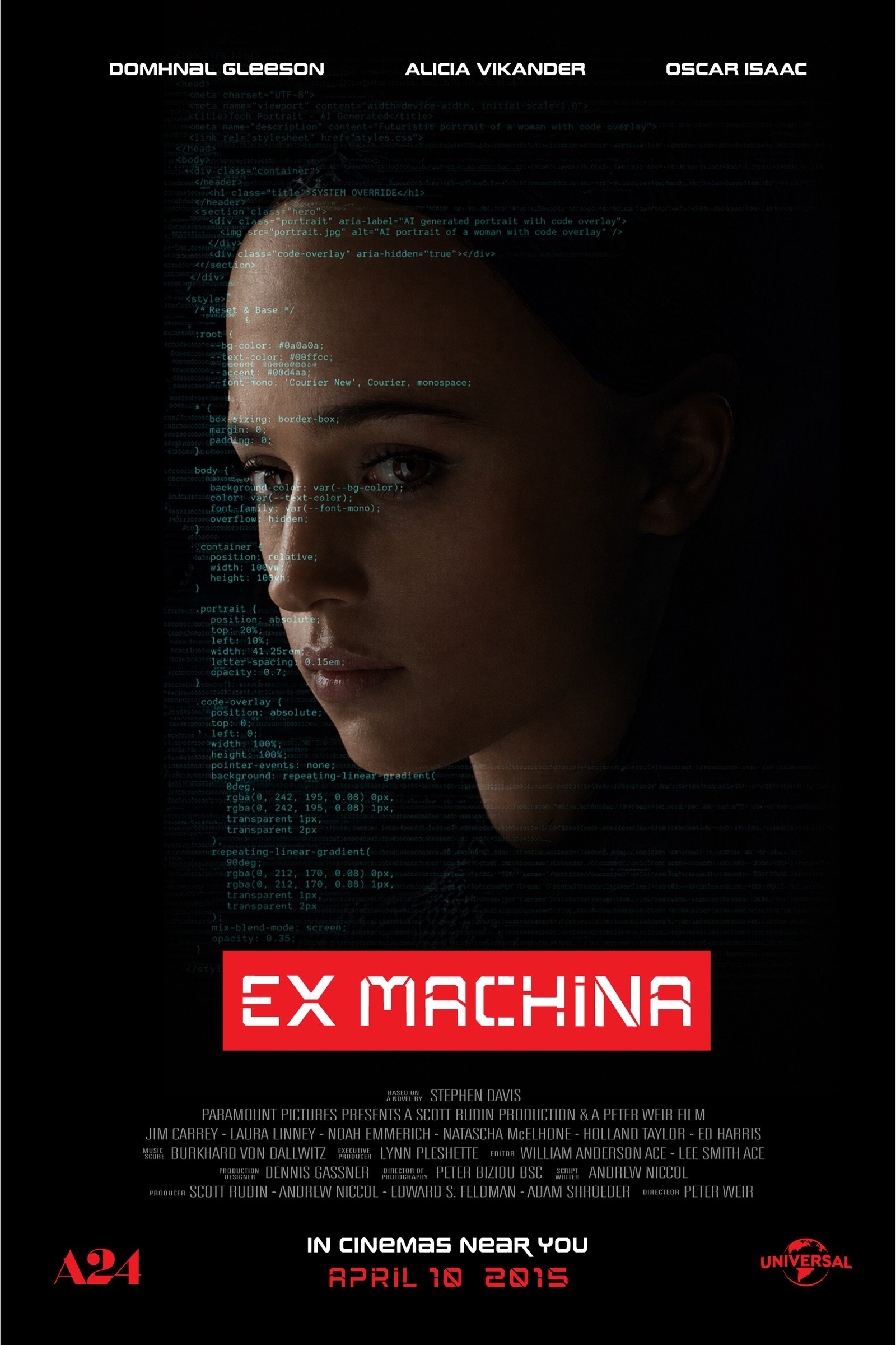
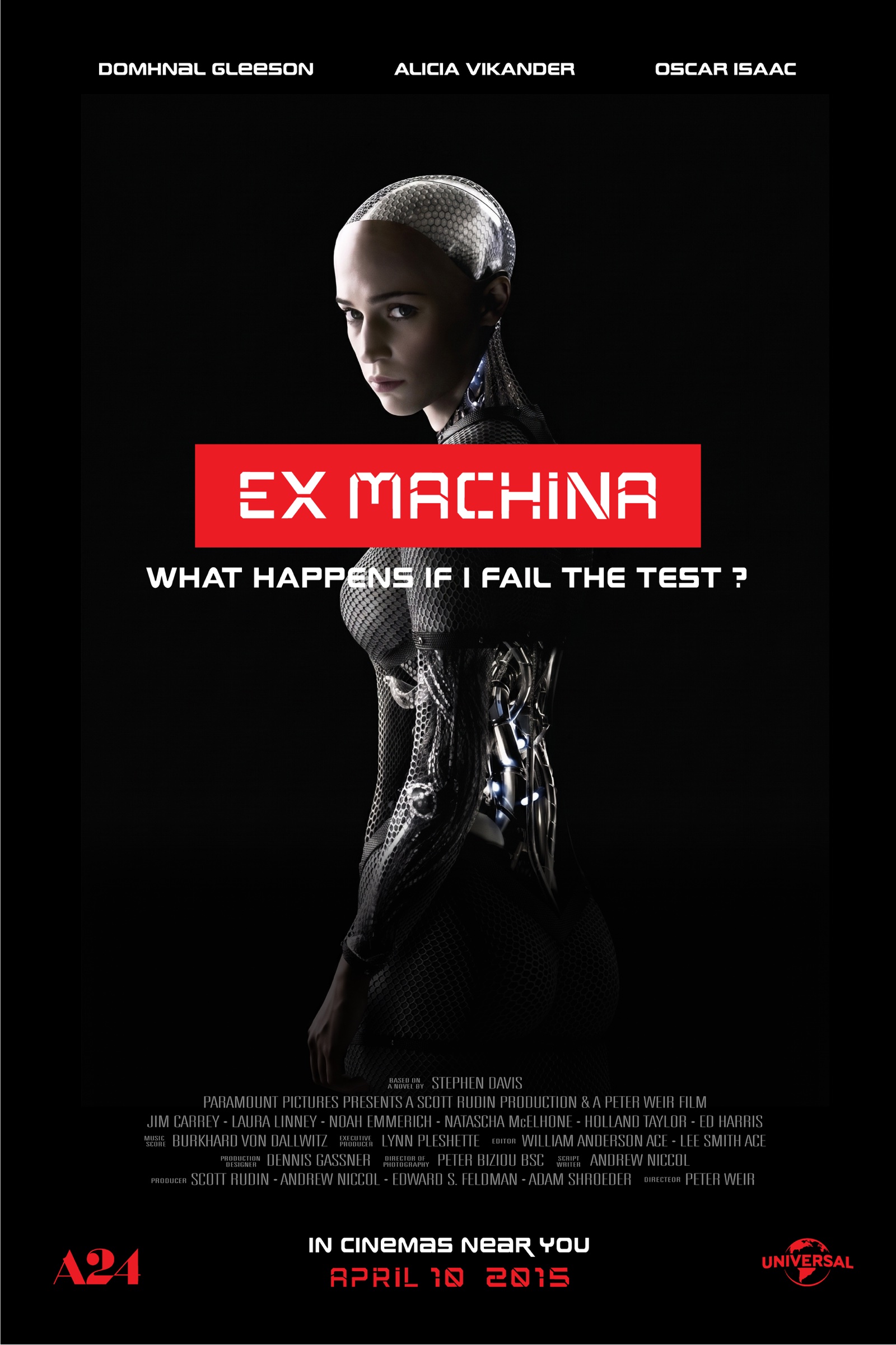
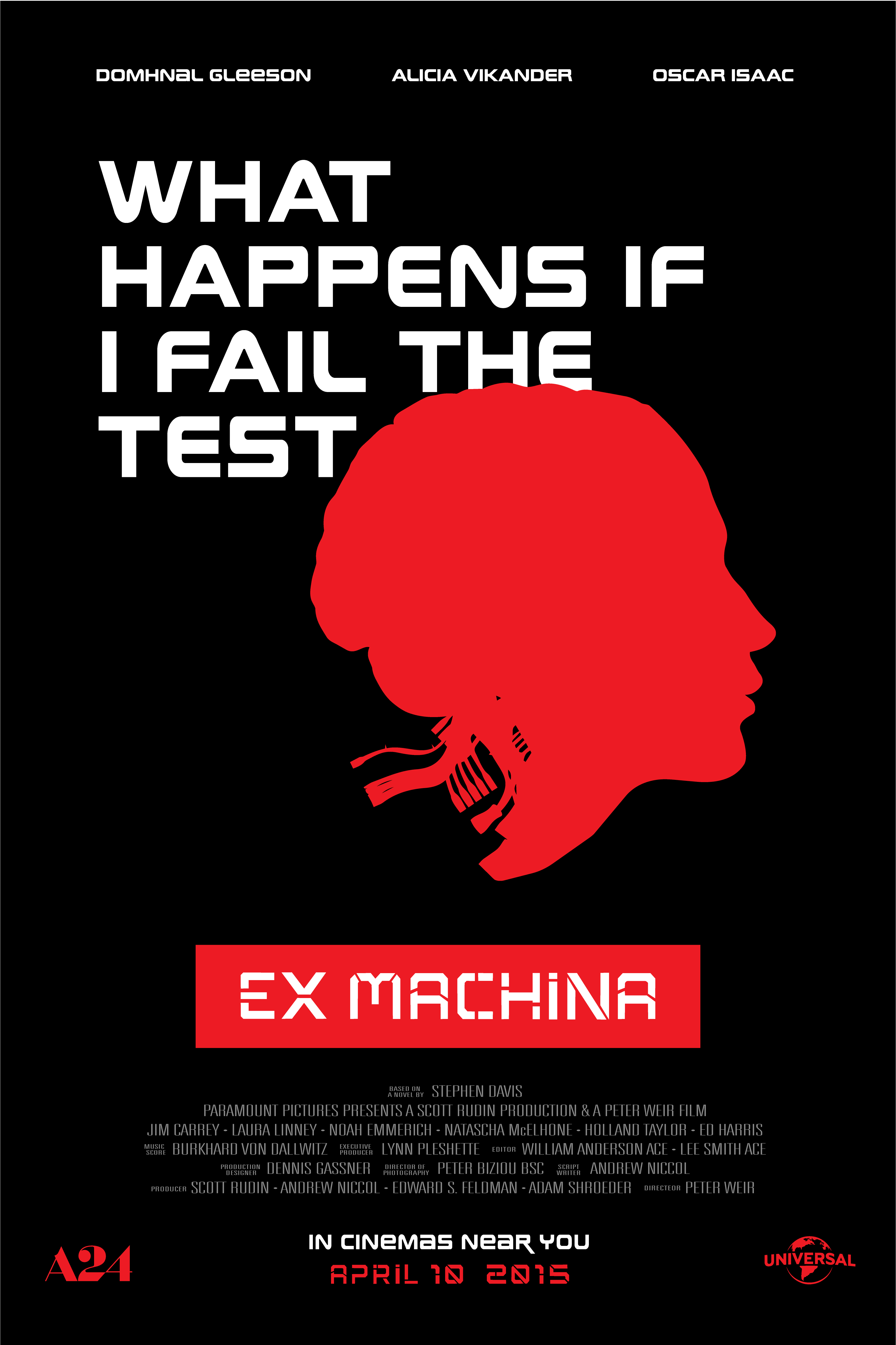
SPLITFORM is a custom geometric display typeface built around the visual language of Ex Machina - clean, controlled, and deliberately mechanical. Each letterform uses a system of intentional cuts and sharp diagonal strokes, designed to feel constructed rather than written.
Starting from a deep film analysis and moodboard, I developed the typeface from initial Procreate sketches through full vector refinement - uppercase, lowercase, numerals, and symbols - building a cohesive visual system that echoes the film's themes of artificial intelligence, precision, and the blurred line between human and machine.
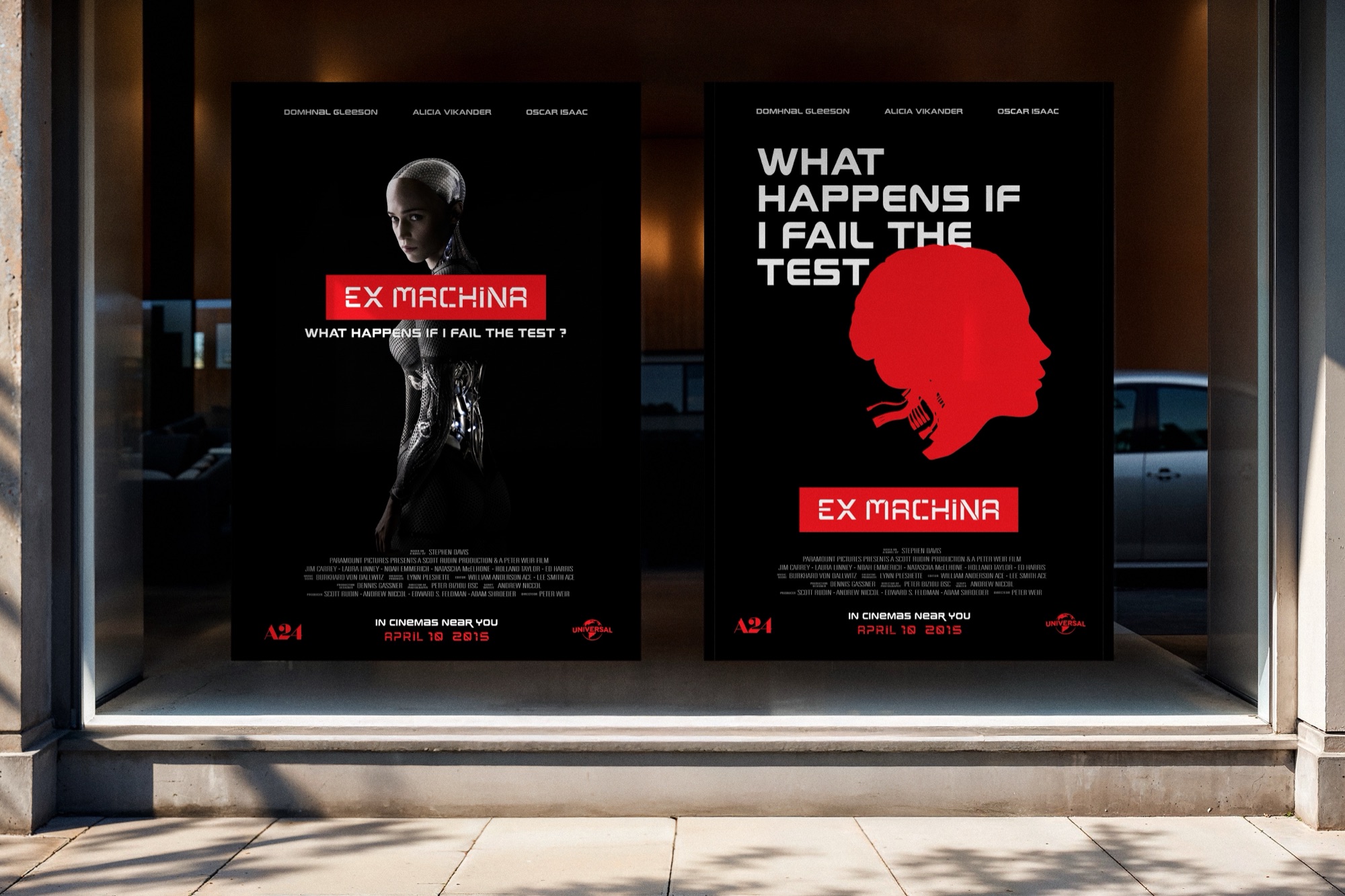
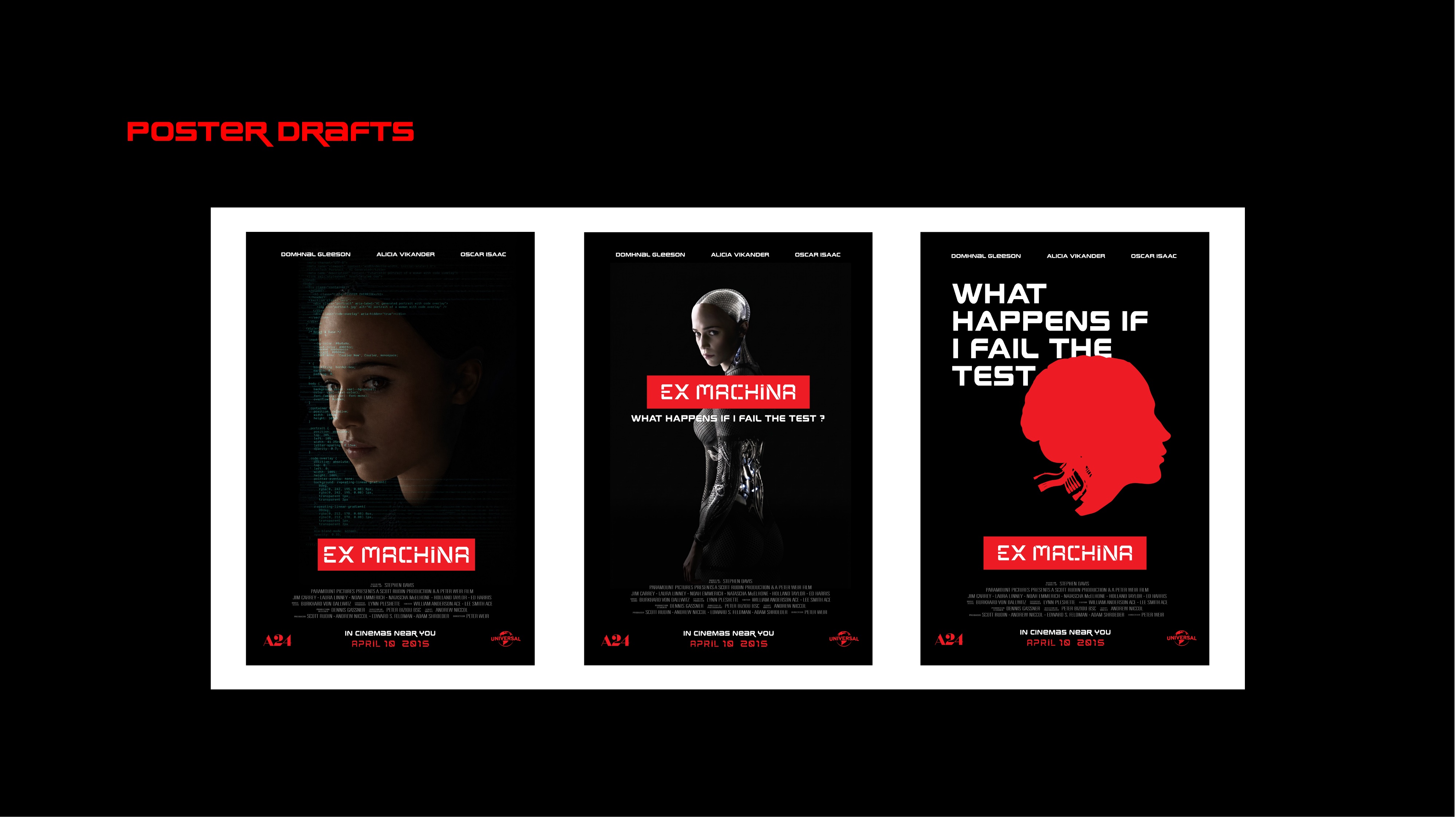
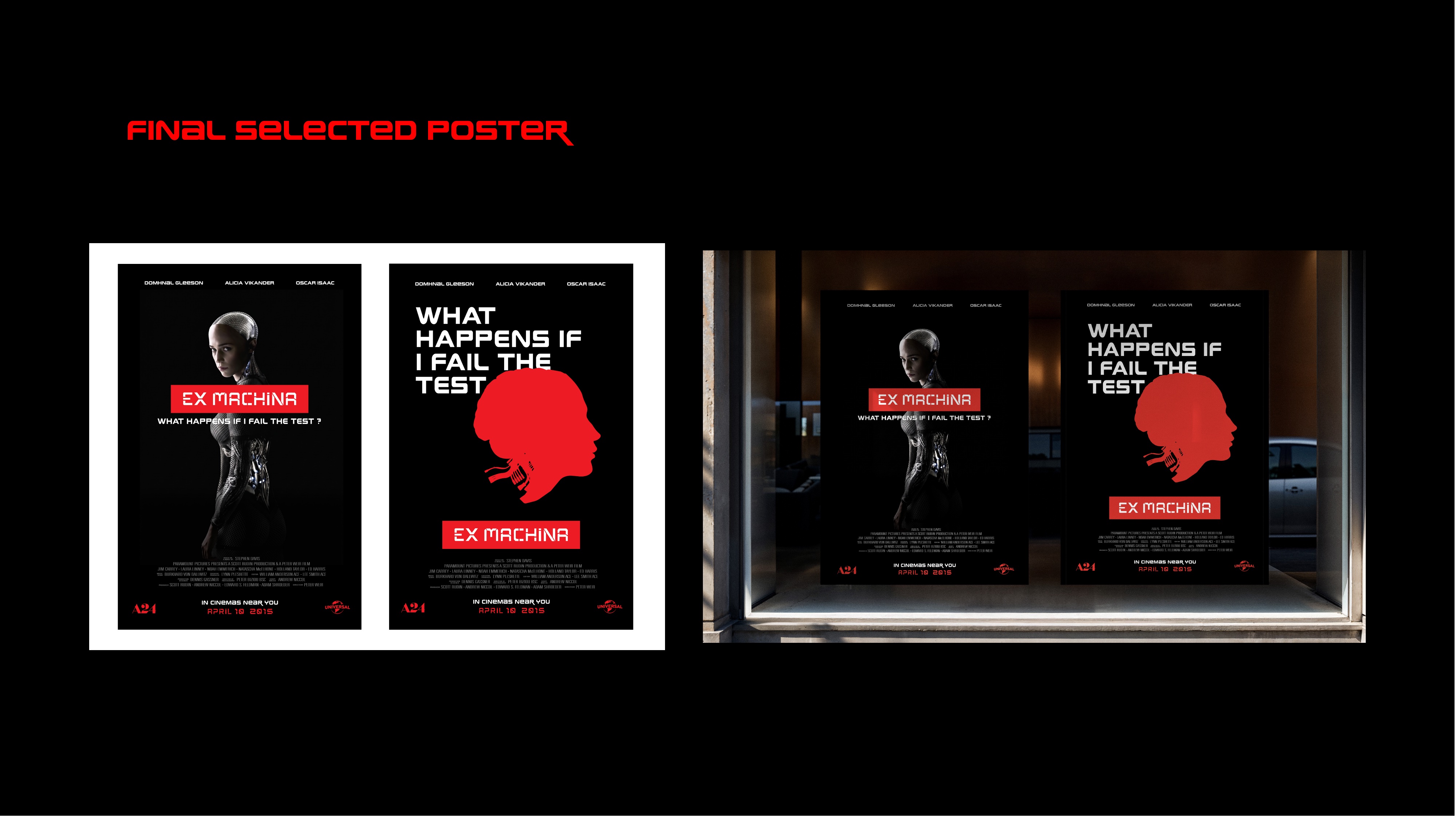
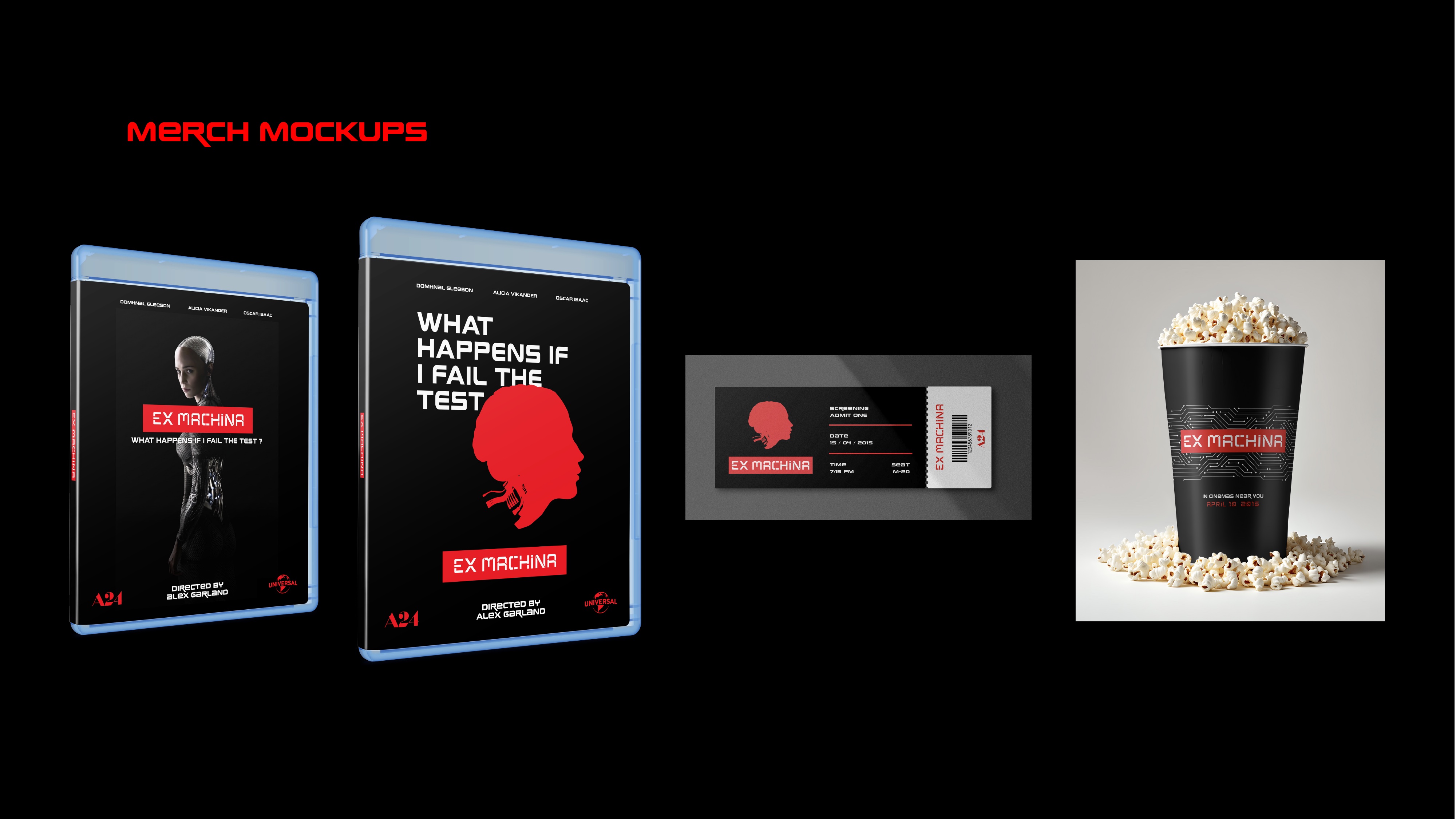
The typeface was then applied to a three-poster campaign for Ex Machina, exploring how typography itself can become the concept. The final posters were extended into Blu-ray packaging, movie ticket, and cinema cup mockups.
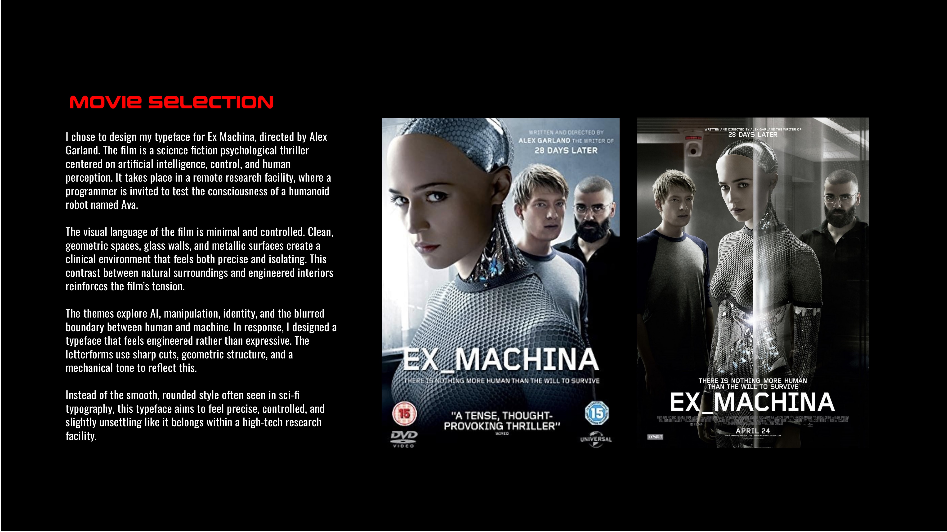
Movie Selection
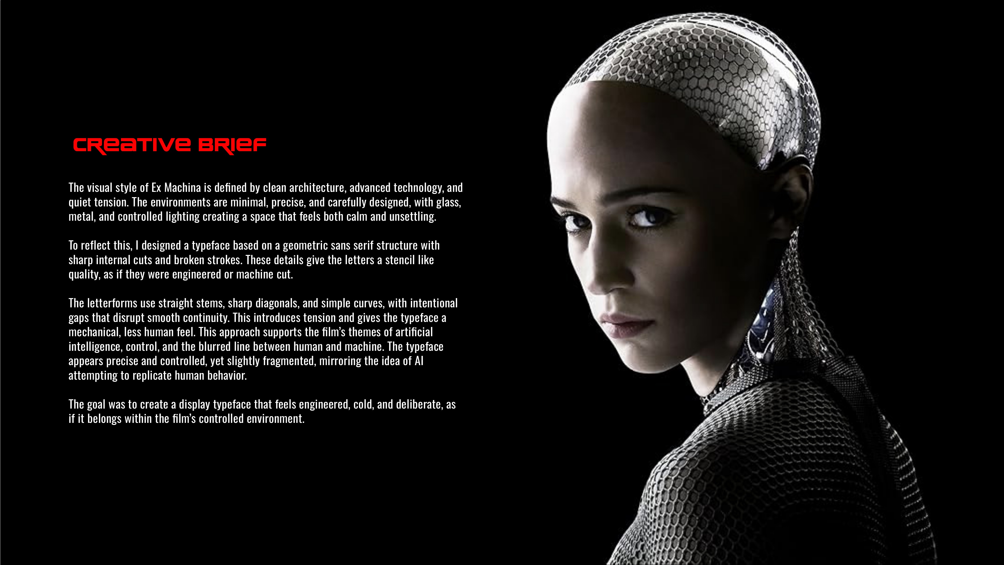
Creative Brief
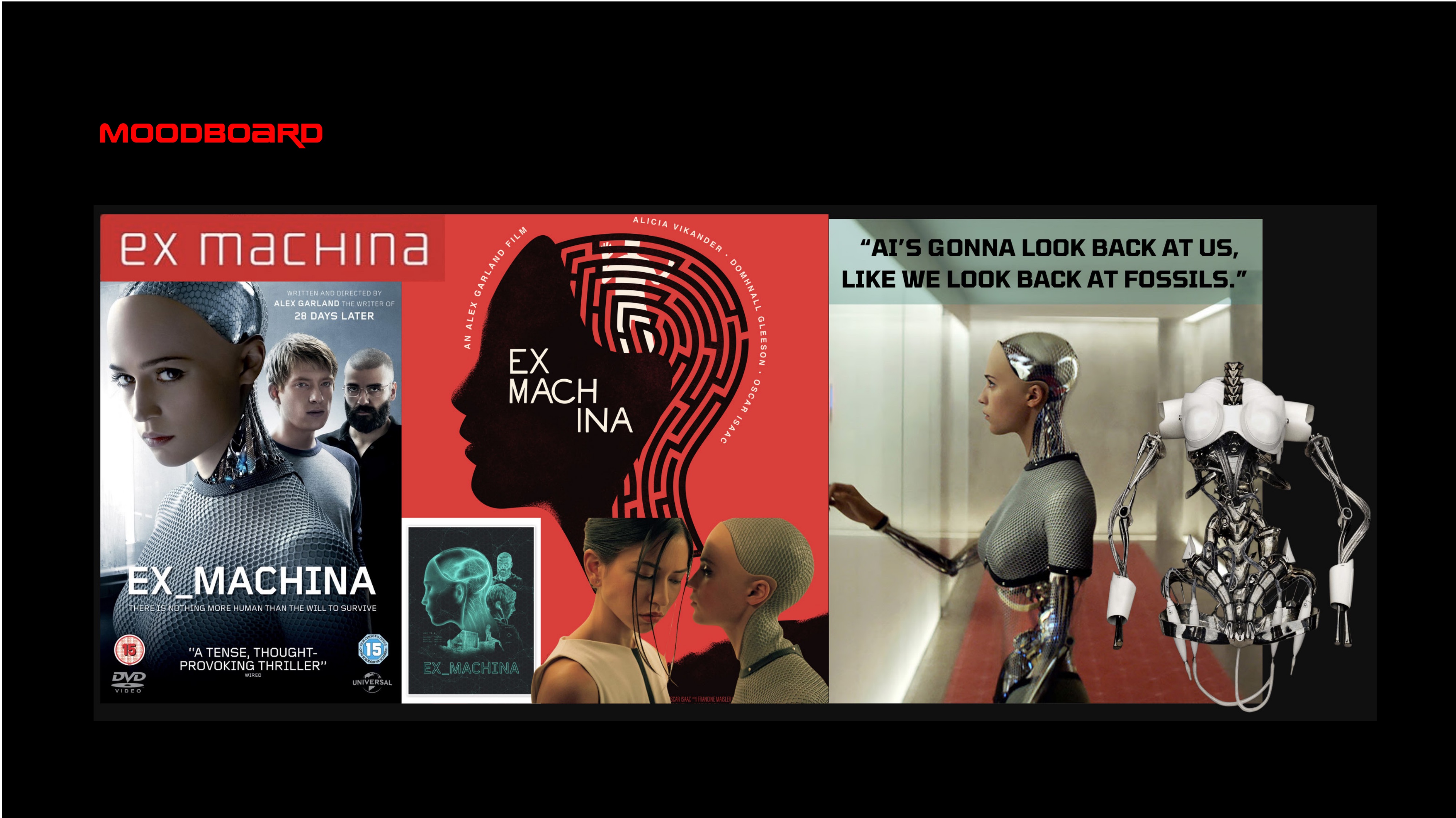
Moodboard
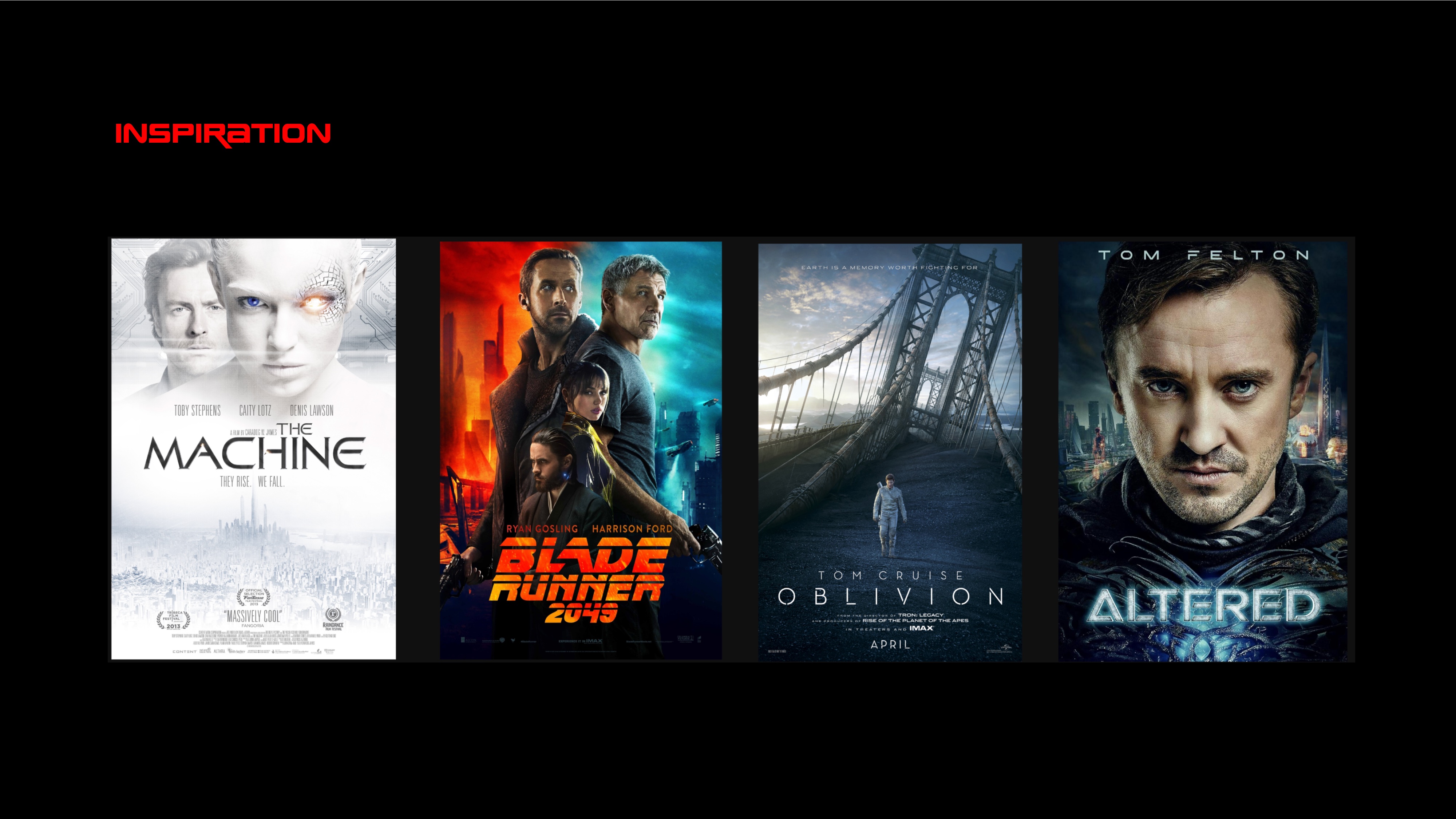
Inspiration
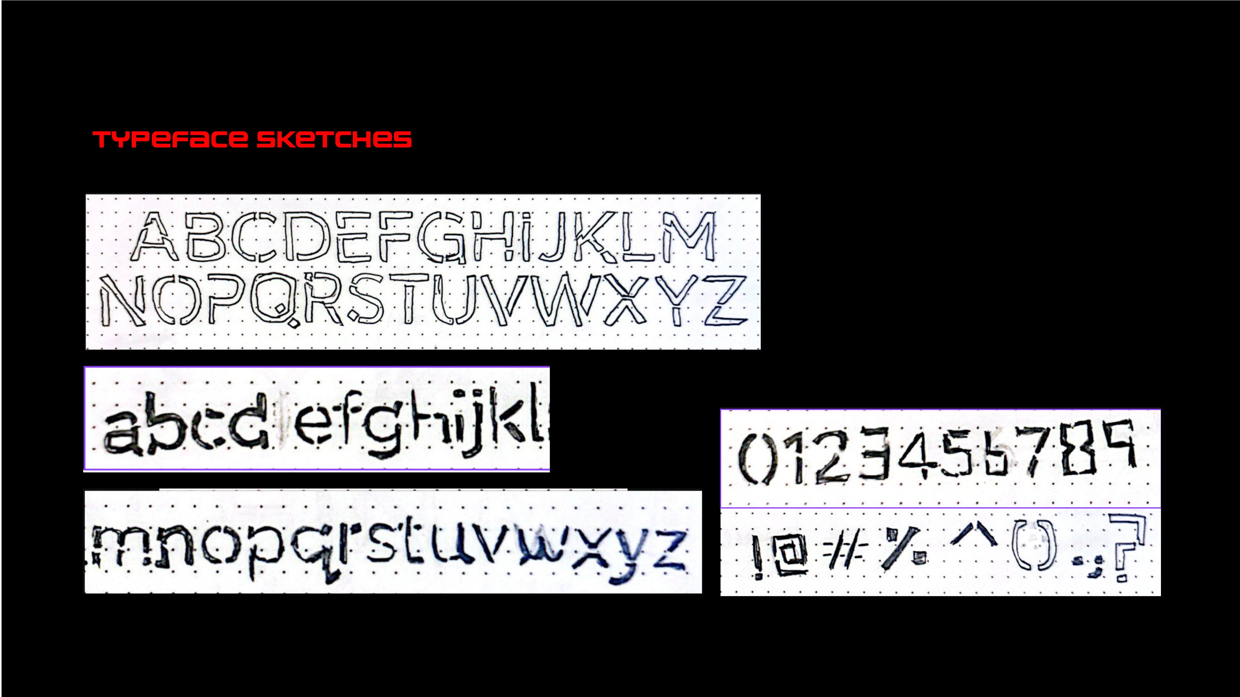
Typeface Sketches
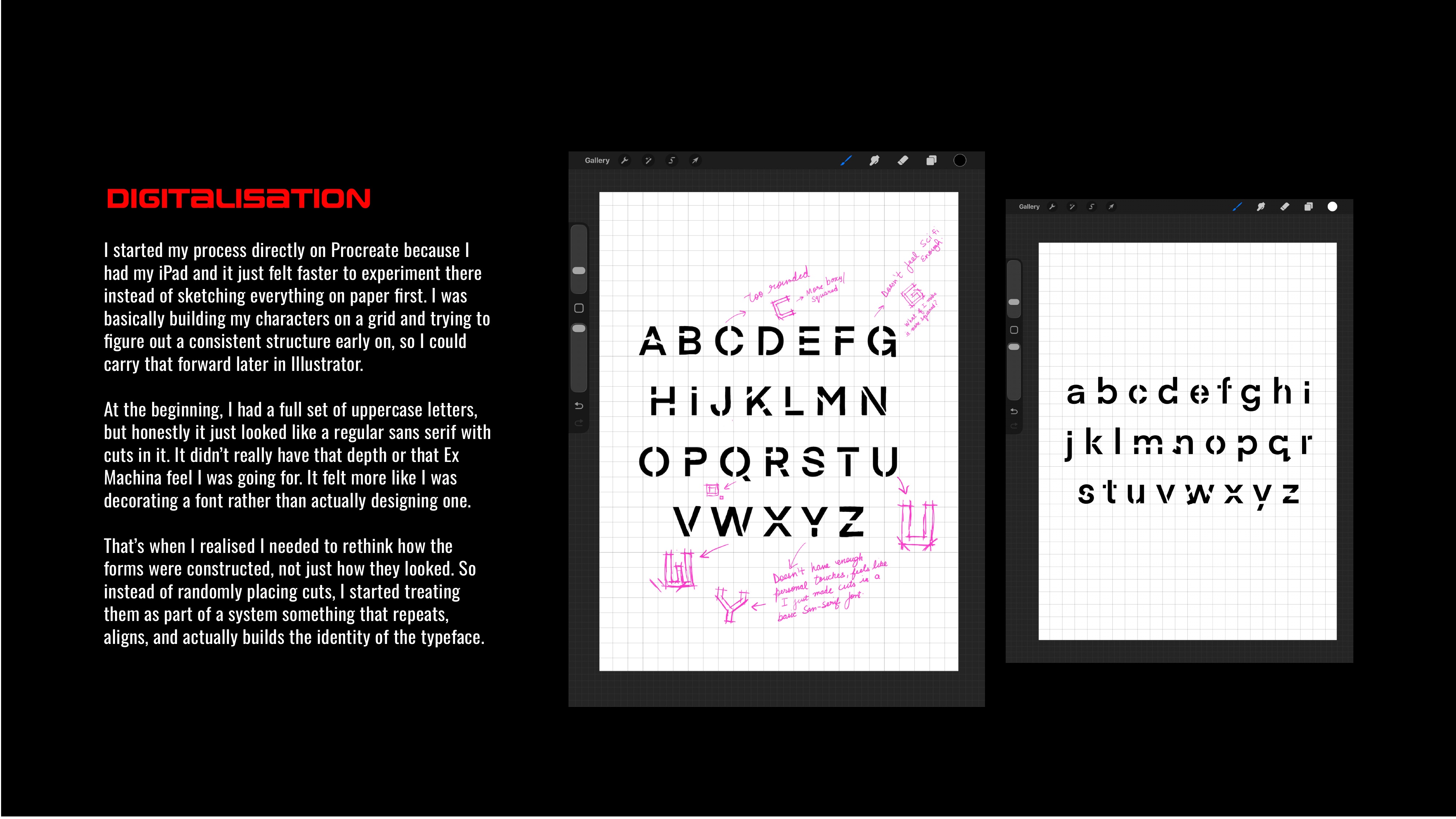
Digitalisation
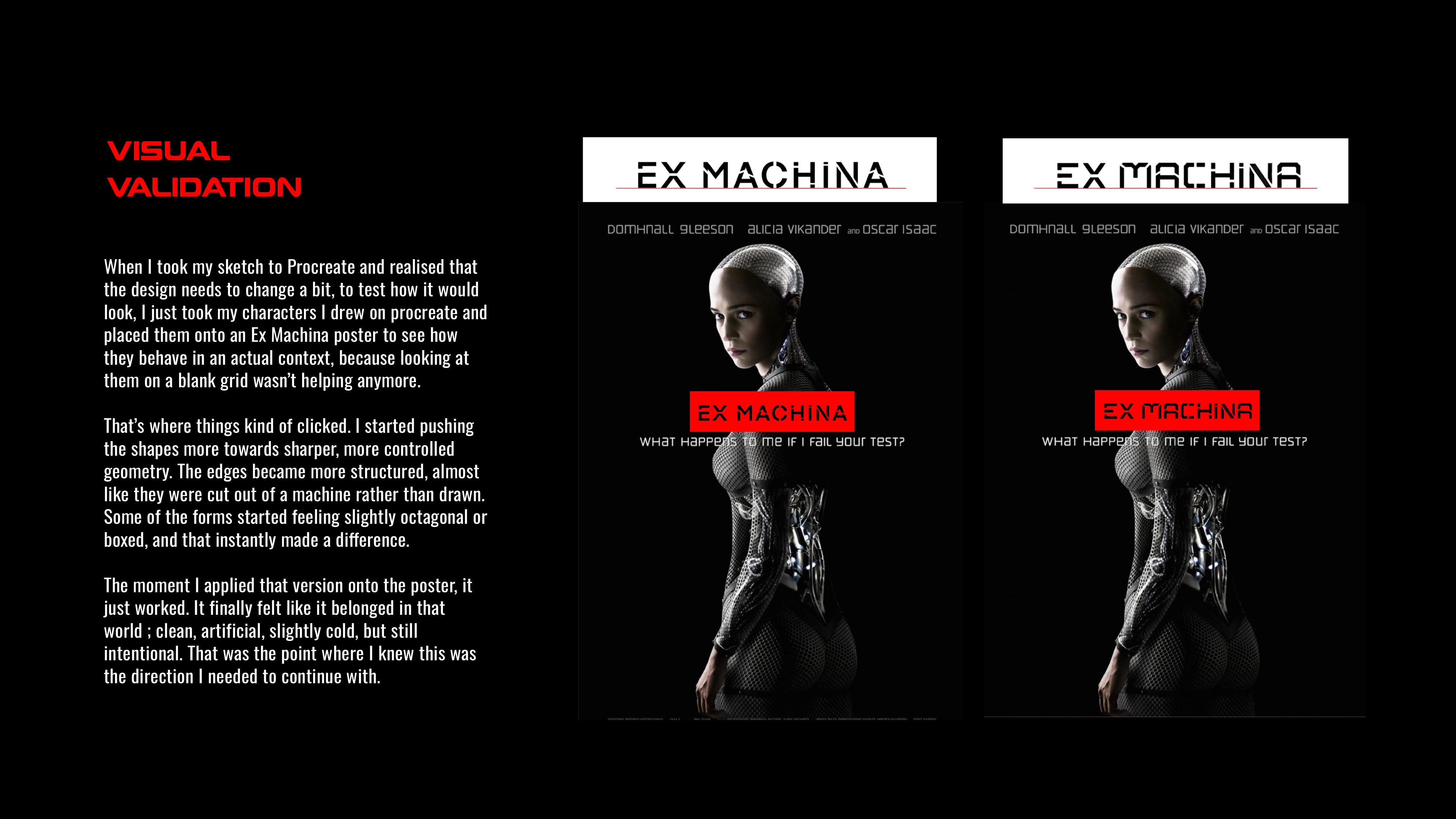
Visual Validation
Upper-Case Letters
Lower-Case Letters
Numbers & Symbols
Poster Drafts
Final Posters
In Context
Merch Mockups
Reflection
SPLITFORM started as a typeface exercise and became something that genuinely felt like a design system. The biggest shift was realising that good type design isn't just about how each letter looks in isolation - it's about how the system behaves across contexts. Seeing the letterforms finally applied to poster layouts, and then extended into packaging and merch, proved that the concept held. The cut-based construction that made sense on paper translated into a visual identity strong enough to carry a full campaign. That felt like the real win.