Pressed Juicery - Packaging Family
Pressed Juicery needed its packaging system extended beyond the bottle line without diluting the brand's clean, health-forward identity - a new packaging family that still reads as unmistakably "Pressed" on shelf.
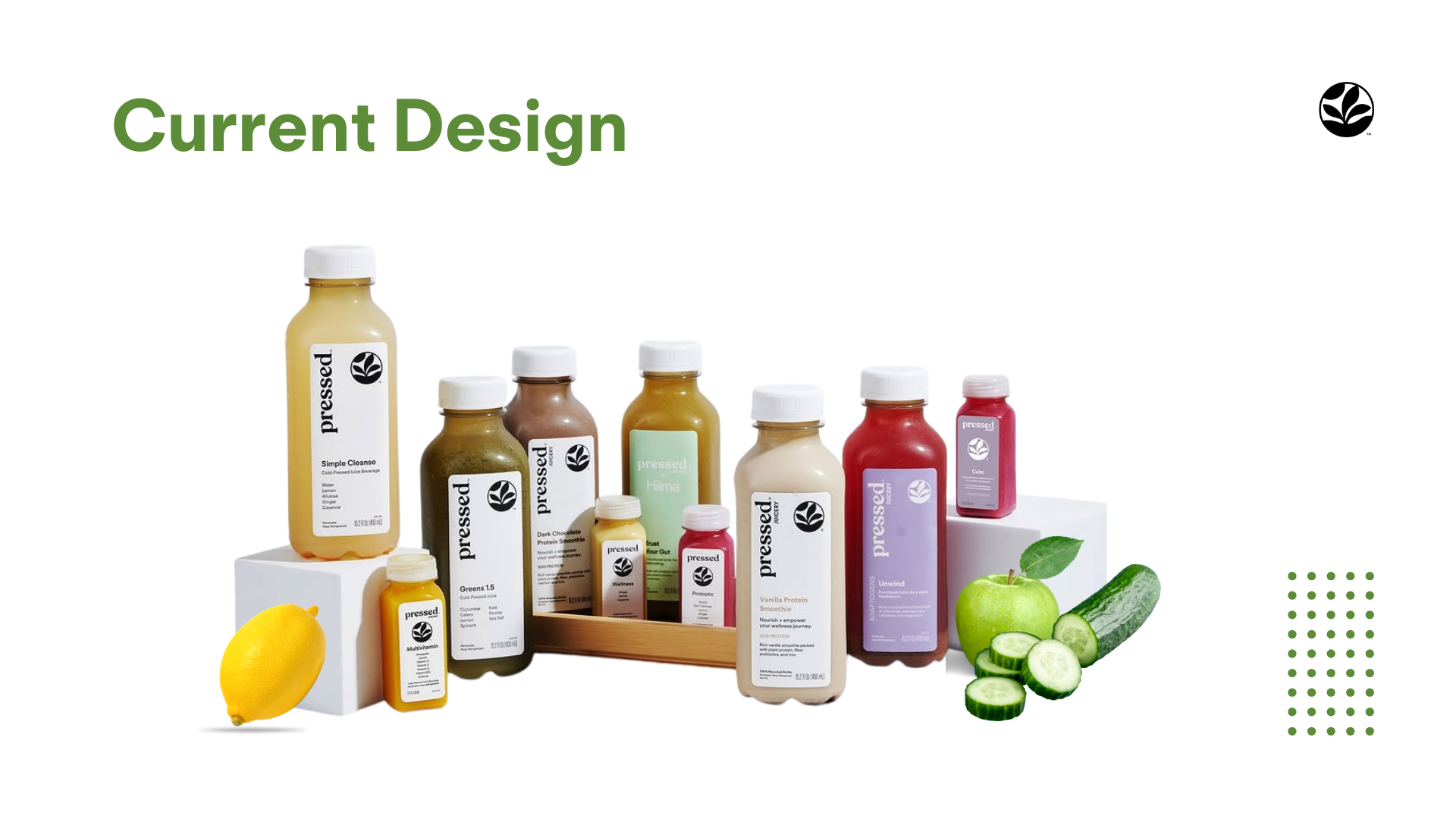
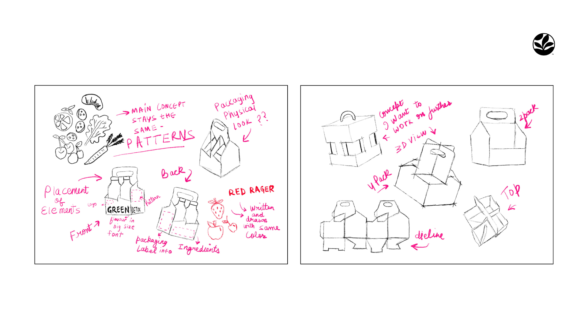
I started by auditing the existing bottle line and building a moodboard around the brand's core values: clean, simple, fresh. From there I worked through structural sketches by hand - testing fold patterns and panel placement before touching a screen.
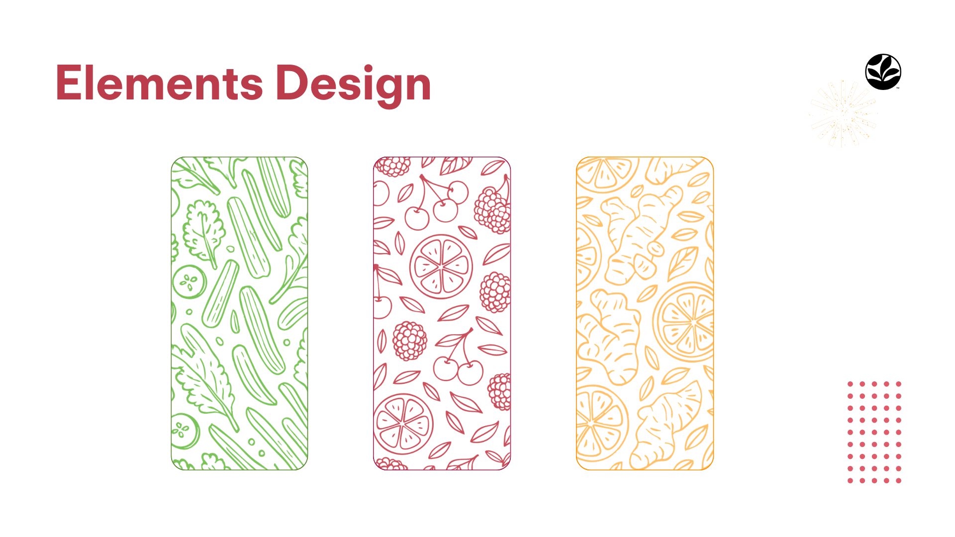
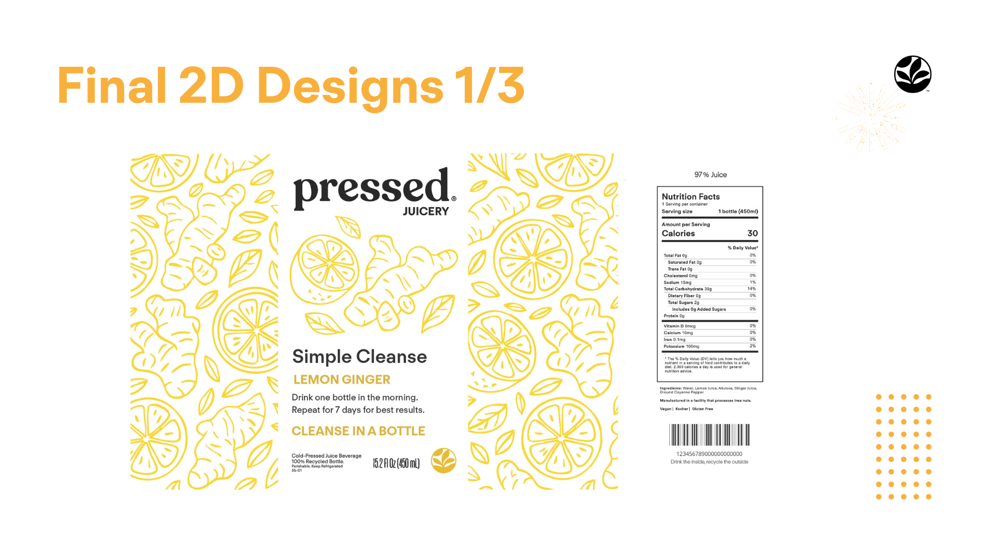
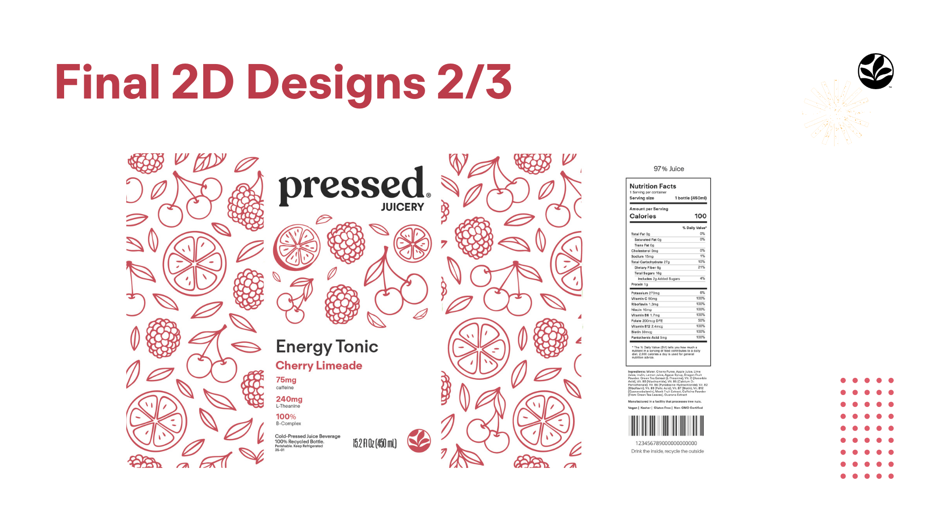
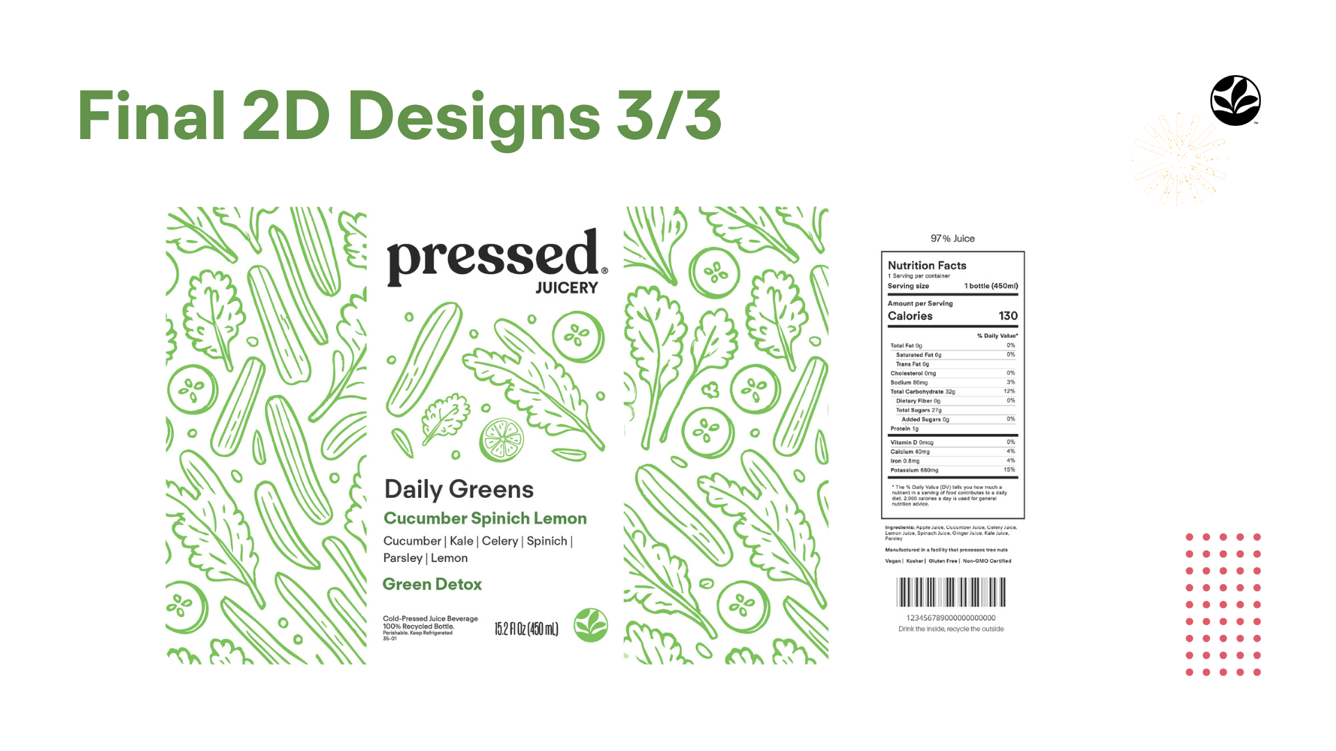
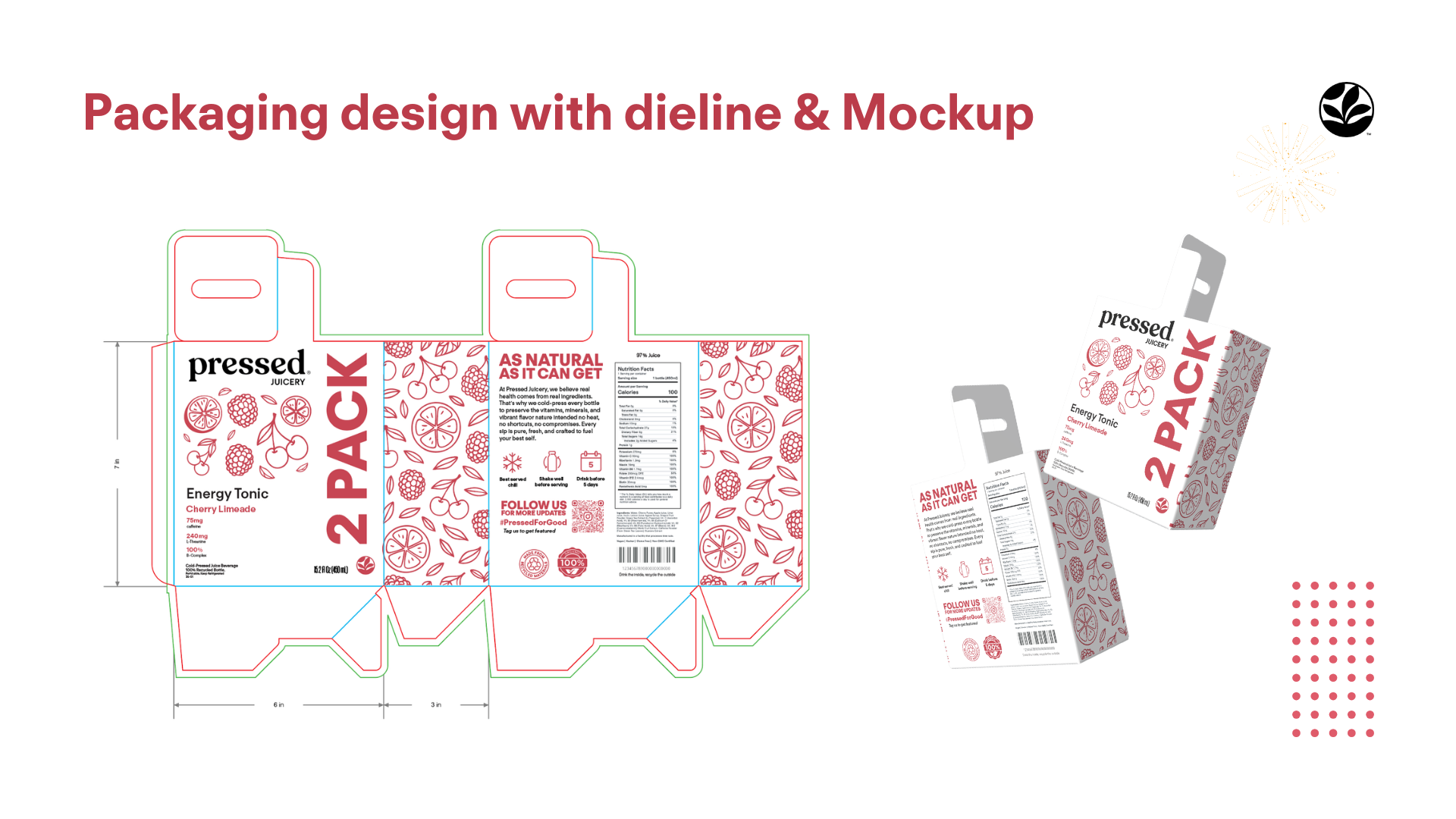
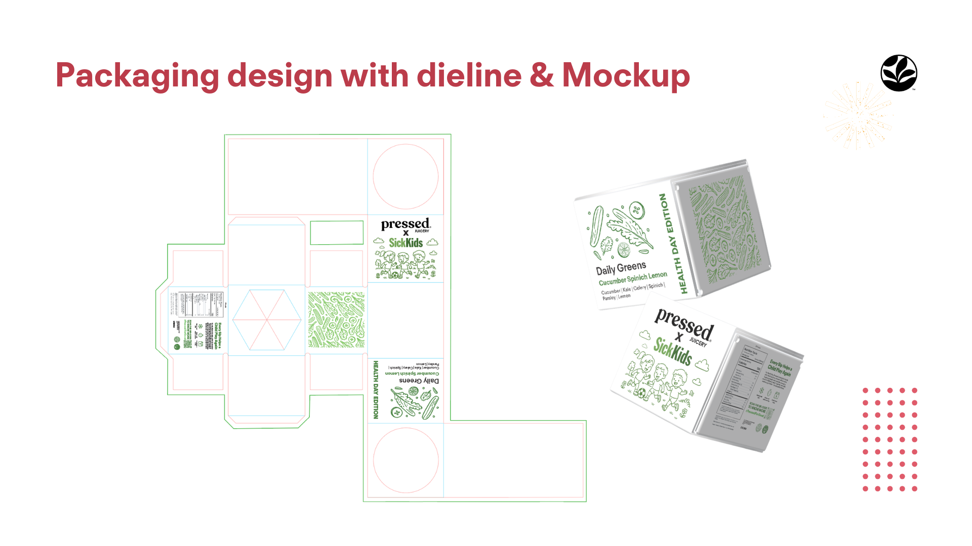
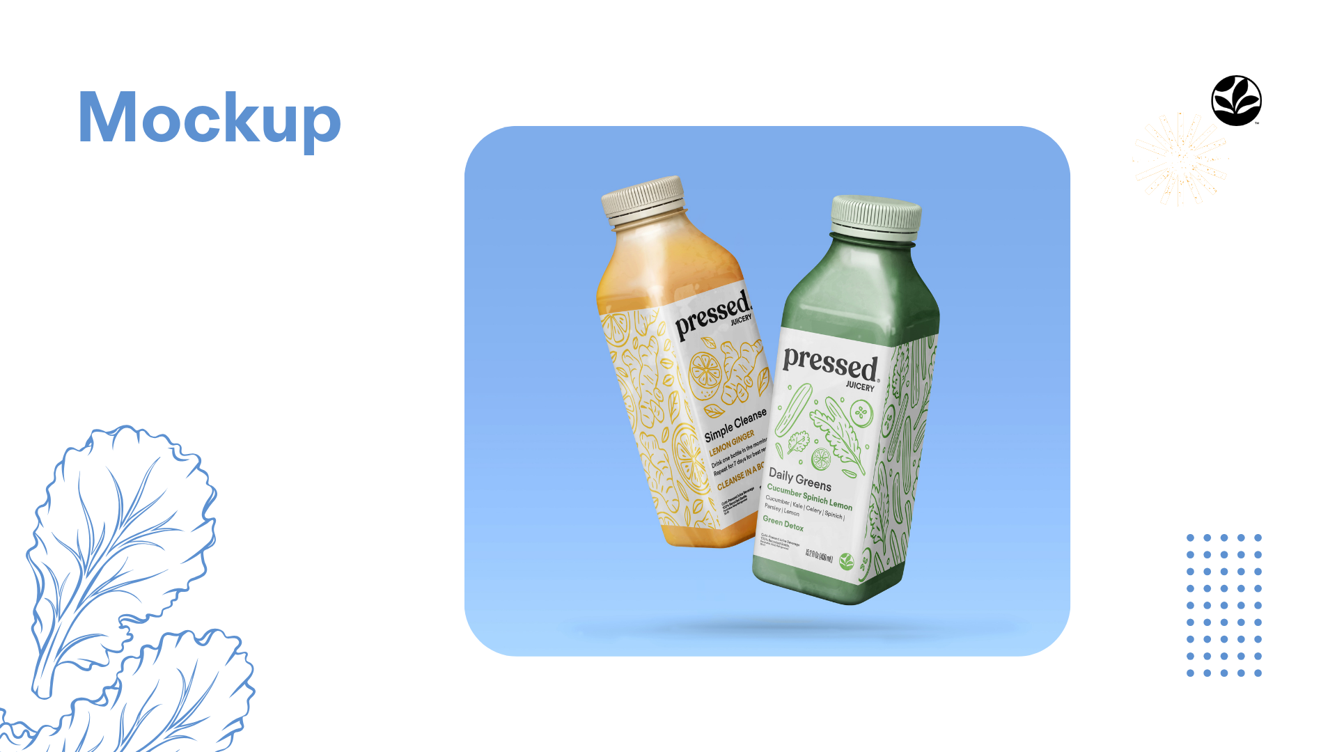
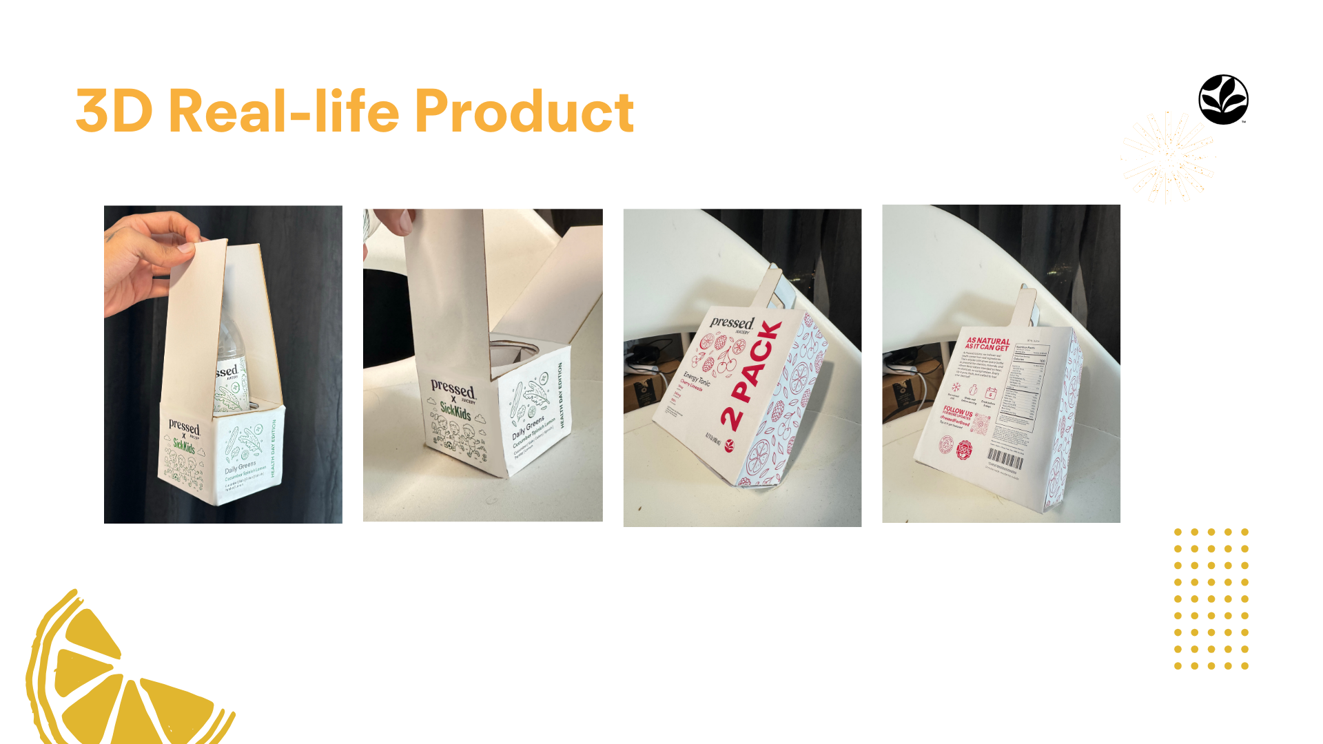
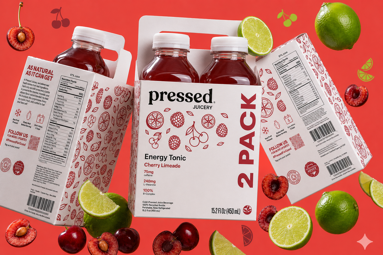
The final system carries the brand's colour-coding and pattern language across both flat label artwork and a fully dielined box structure, mocked up digitally and then built as a real folded prototype to pressure-test the proportions in hand.
Background
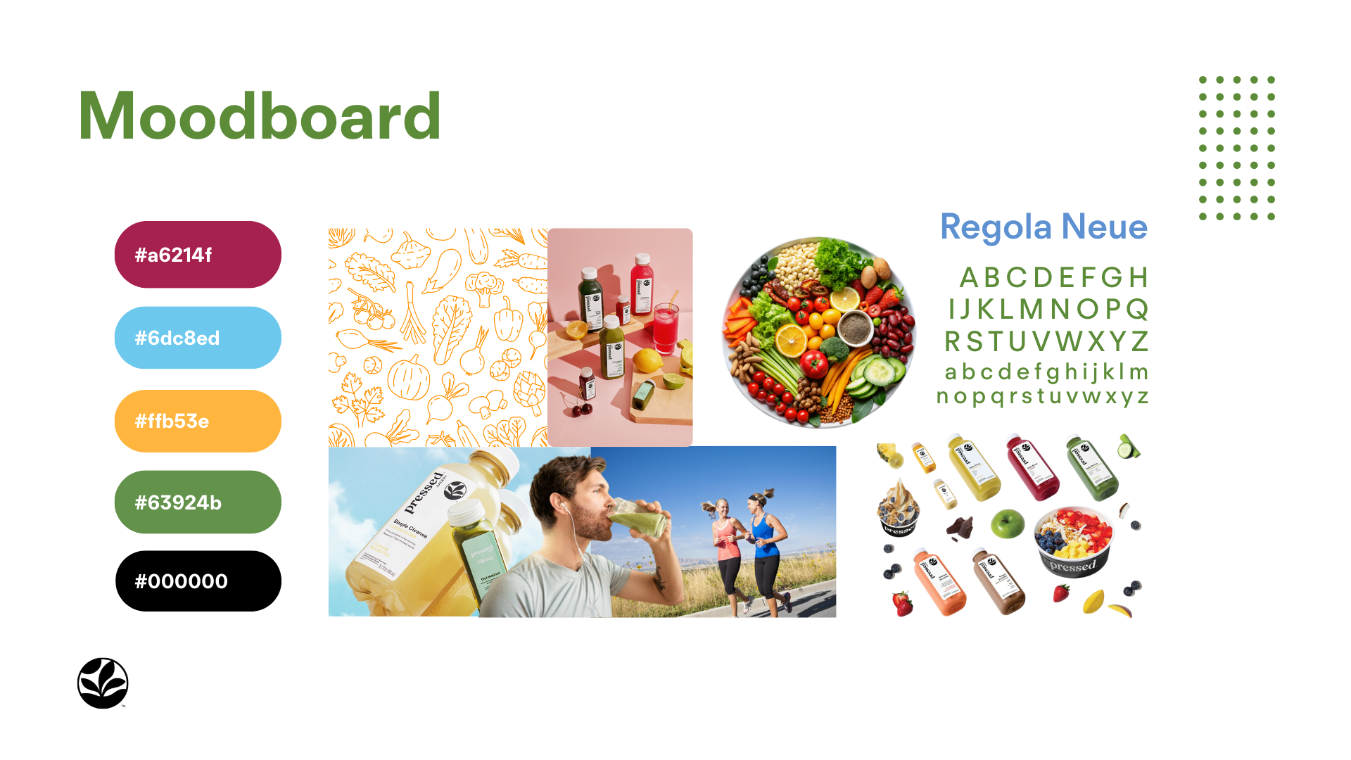
Research & Moodboard
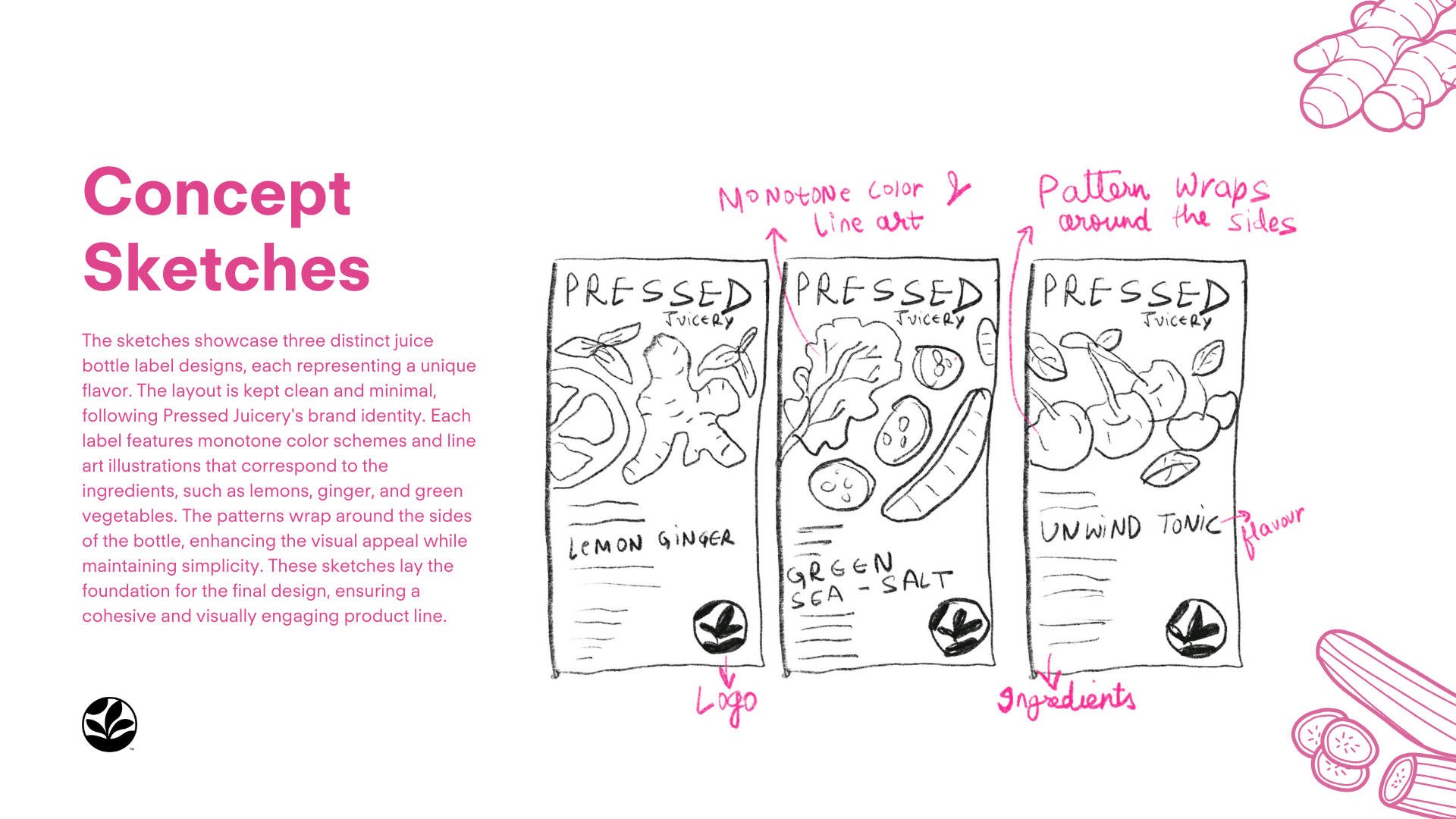
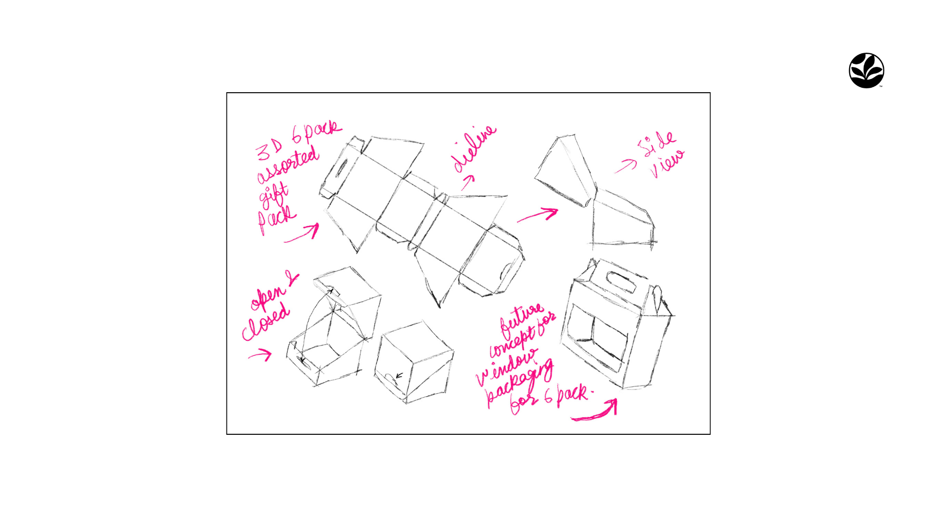
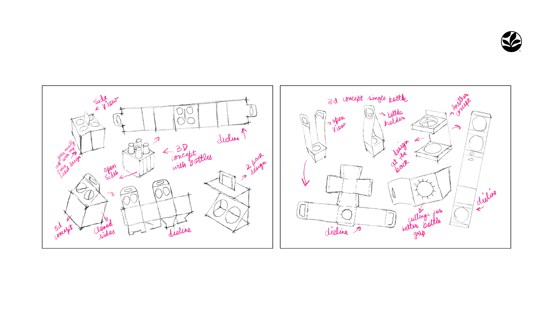
Sketches & Exploration
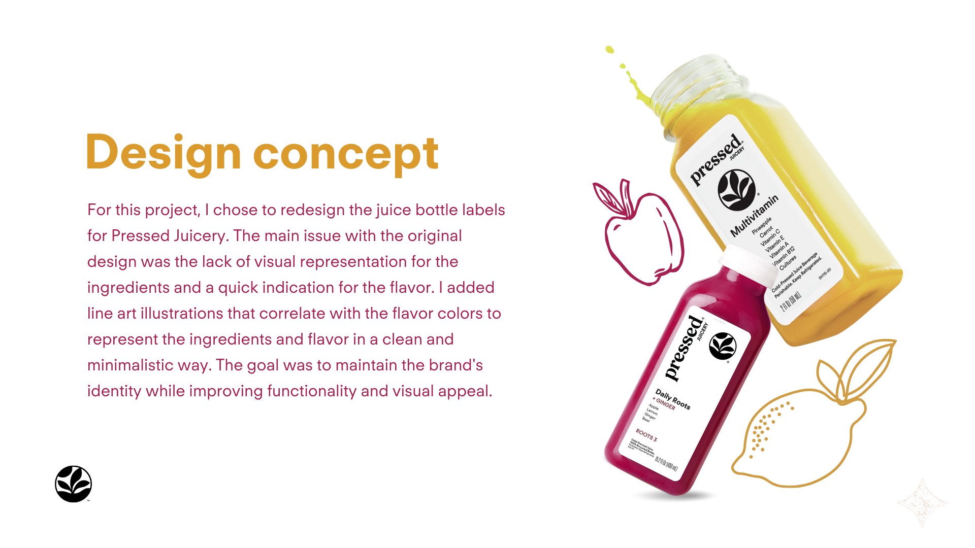
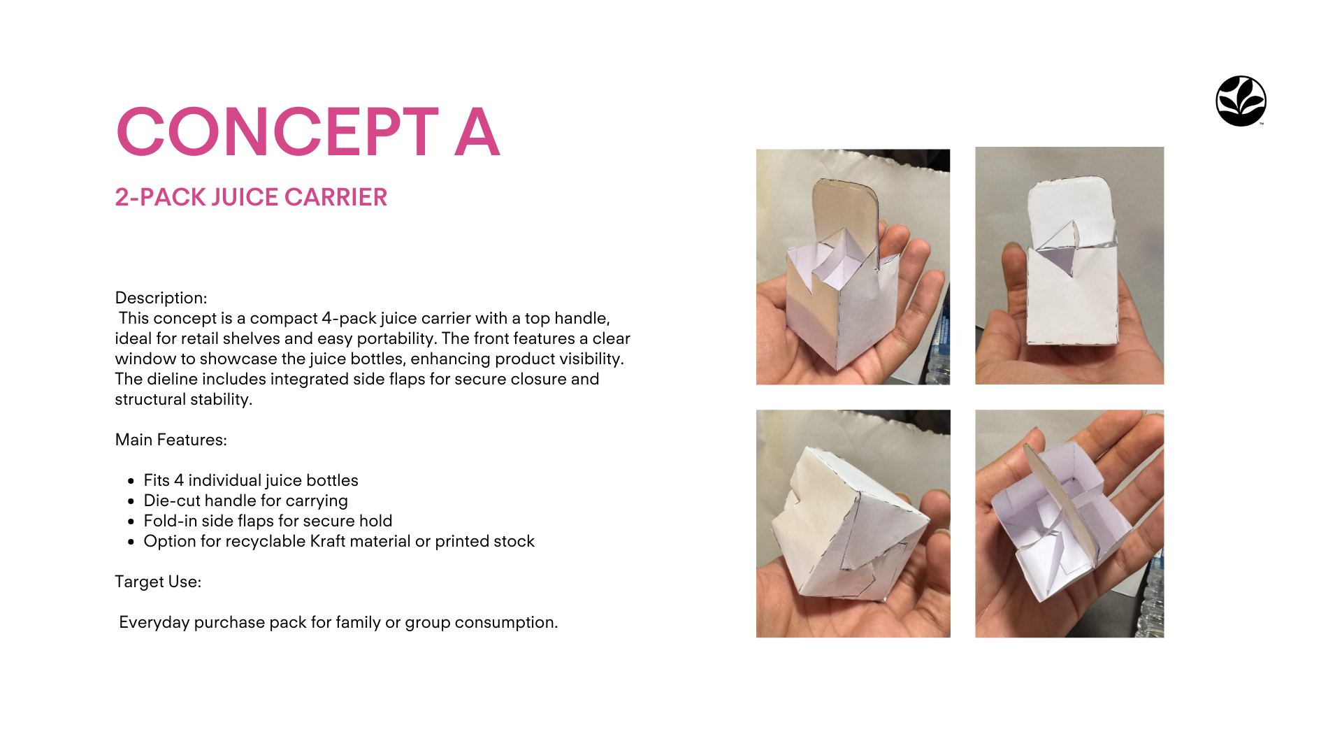
Chosen Concepts

Final Designs & Mockups